-
Photoshoot #2 planning
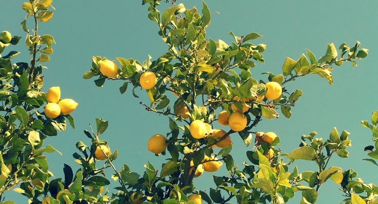
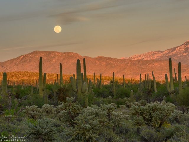
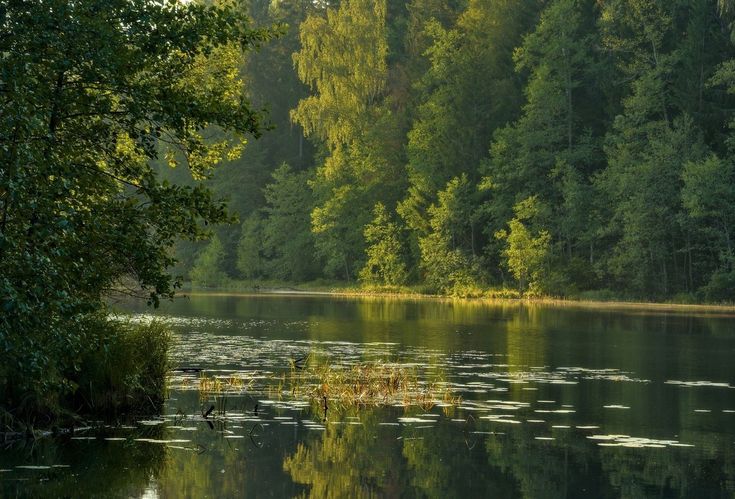
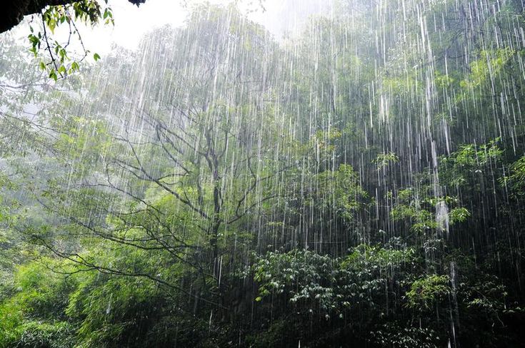
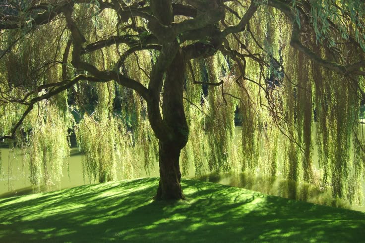
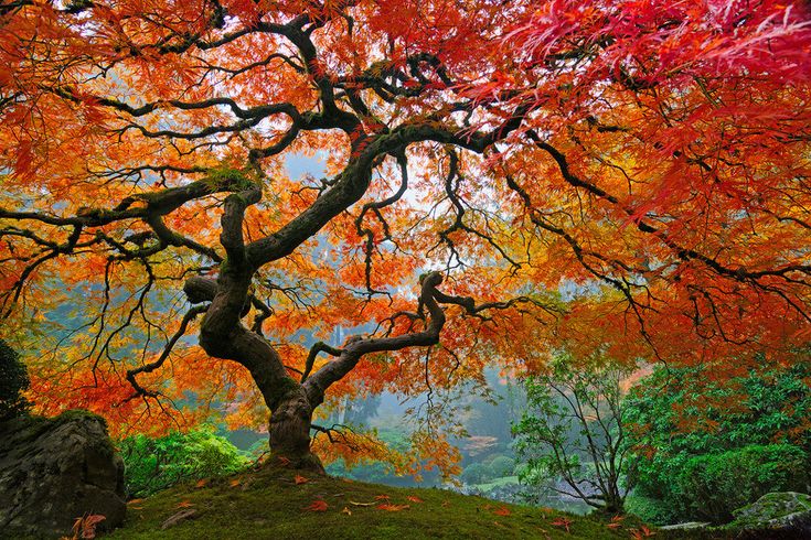
This photoshoot will be the most professional photoshoot with the most effort because the photos will be on the front and back cover of my magazine, as well as some pages inside (4 photos are needed). This photoshoot will be of the garments that I will design and create out of ‘garbage’ (plastic bags, paper bags, etc). Theme: The theme of this photoshoot will be ‘Man-made VS Nature’ and The man-made part will be my designs – both the garment and materials are man-made and the location will be the nature part. My photos will obviously show contrast, but I also want to show visual contrast through colours, so I…
-
Mini-Photoshoot #1 planning
My first photoshoot was in Morocco. I wasn’t too far along in my blog to make a photoshoot plan, but here is a short plan I made before the trip to know what photos I need to take amongst other things: I decided I only needed 1 question which will give me the content I need for my article, then the interviewer can give whatever details they want, making each story different from each other. Unfortunately, I didn’t have a camera to take the photos, so I used my phone (iPhone 12) and my parents’ phone (iPhone 14 Pro and iPhone 16). As I’ve mentioned before, there will be no…
-
Research and Planning: Magazine Brand Identity
Genre: My magazine’s major genre is fashion, but more specifically, sustainable fashion. My magazine aims to encourage people to think twice about their choice when it comes to fashion (buying new clothes, ordering from fast fashion brands, etc) and also to influence them to think that they have the power to help the climate become a better place. Masthead: I chose the word fusion because I want to blend 2 topics (sustainability and fashion) in a way so that it can be seen as ‘chic’. Fonts: For my fonts, I chose fonts with serif because I think they look more elegant and for headings and titles, I decided to also…
-
Research and Planning: Fonts, Text, and Other Conventions
For my font for my texts I want to have a font with serif (a small stroke added to the end/beginning of a letter). I think fonts with serif adds an elegant and classic touch, which I think perfectly suits articles in general. I used Google Fonts to browse some fonts with serif. I wanted to make sure that the writing with each font makes a text easy to read. Here are the ones I liked the most: Even though most of these fonts look extremely similar at first glance, this is pretty challenging for me because I want my readers to be able to read my articles (as well…
-
Research and Planning: Table of Contents
Since I have all my contents ready, I will be able to make my table of contents easily. This is the original idea for my table of contents, but the title highlighted didn’t sit right with me because it sounds a bit like guilt-tripping the reader, which is not ideal and not at all what I am aiming for with my magazine, so I thought some more about the title for that section and came up with a new title: Unfair and Unfashionable Here is the final table of contents: 4. Editor’s Note 6. Unfair and Unfashionable– Fashion Overconsumption Core (The article I will write)– The hidden plastic in our…