
Research and Planning: Fonts, Text, and Other Conventions
For my font for my texts I want to have a font with serif (a small stroke added to the end/beginning of a letter).
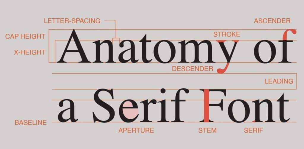
I think fonts with serif adds an elegant and classic touch, which I think perfectly suits articles in general.
I used Google Fonts to browse some fonts with serif. I wanted to make sure that the writing with each font makes a text easy to read.
Here are the ones I liked the most:
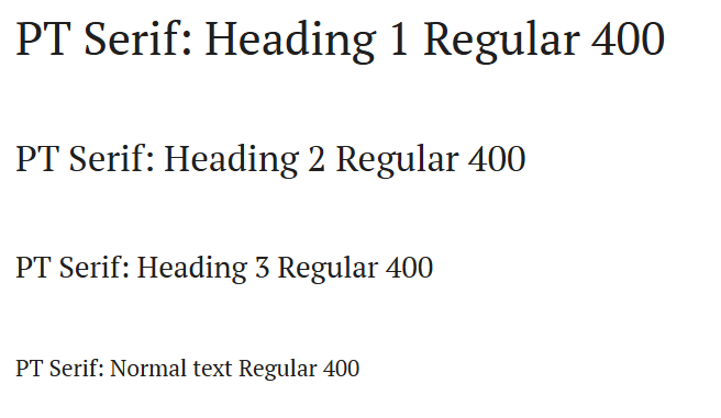
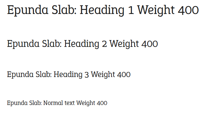
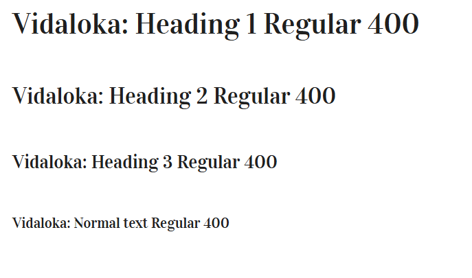
Even though most of these fonts look extremely similar at first glance, this is pretty challenging for me because I want my readers to be able to read my articles (as well as the rest of the texts) easily and for it not be a pain for the eyes. And for this, I need a font that doesn’t have too much space in between, but the letters shouldn’t be too close together. Also, it depends on how thick and thin the letters are: I want my article heading to be noticeable, therefore, thick, whereas the article font should be a little more thinner.
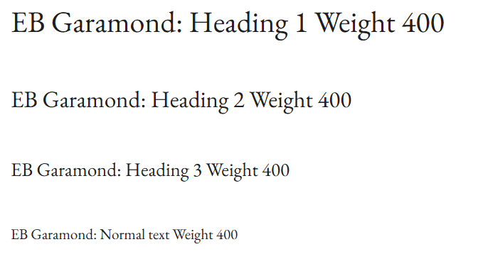
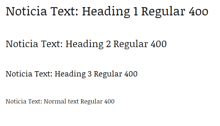
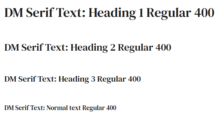
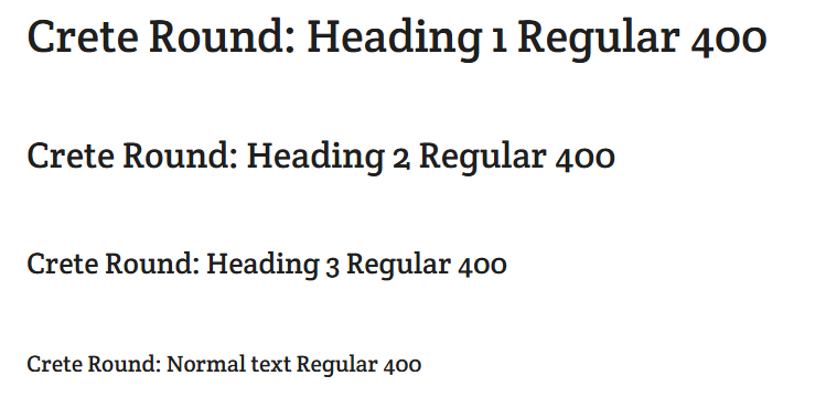
Here are my final options:
For the body paragraph, I decided to use this font because, for me, this font didn’t hurt my eyes when I was trying to read the text through the screen, which is my main goal. I want my audience to be able to pick up on words easily instead of trying to keep their eyes open to read articles. Other than this, it also fits into the aesthetic of articles and formal texts.


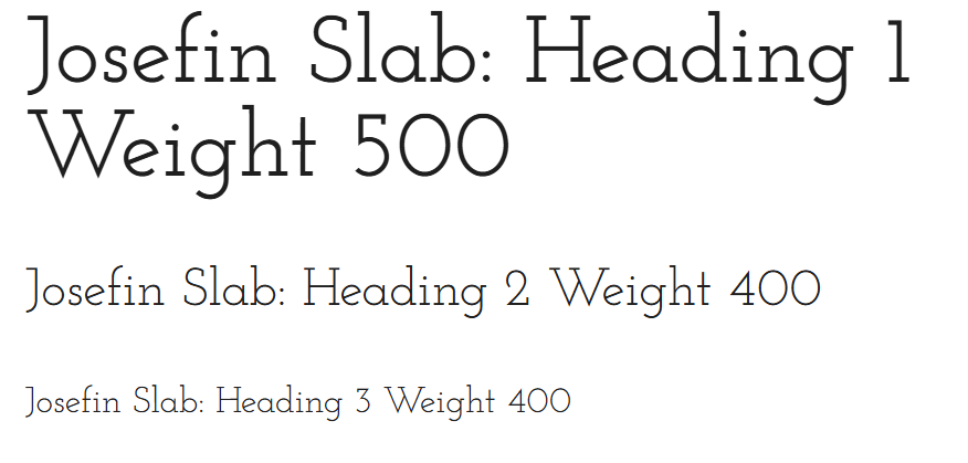
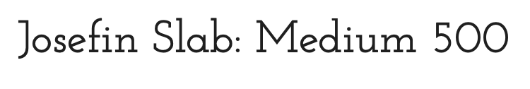
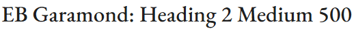
For titles and headings, I decided to use a mixture of two fonts that shows different versions of classy. I really like the combination of these two because, even though they are both very elegant, they still show a contrast, and I think it will go very nicely with the contents of my magazine.
For captions and other texts, I decided to use this font, but made it a little thicker so that it can be noticeable. This font is also very classy and elegant so it matched with the font for the headings, but it also doesn’t stand out too much, which is why it’s perfect for small details.
Selling line:
I want my selling line to either mention elegance, culture, and sustainable fashion, or for it to be very general so that it makes the audience curious. Here are the two that I think fits perfectly:
Embrace Elegance, Celebrate Diversity: Fashion with a Purpose!
Discover fashion with a purpose!
I decided to go with ‘Discover fashion with a purpose!’ . I think it is very catchy and also the word discover makes the audience wonder what fashion with a purpose is.
Barcode:
I used this site to help me create the barcode for my magazine.
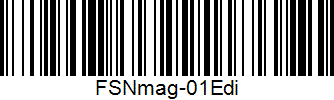
Creating this was very simple because I just needed to have some short data about my magazine.


You May Also Like
Research and Planning: Table of Contents

Preliminary Project #2: Snapshots – Research and Planning
