Fonts:
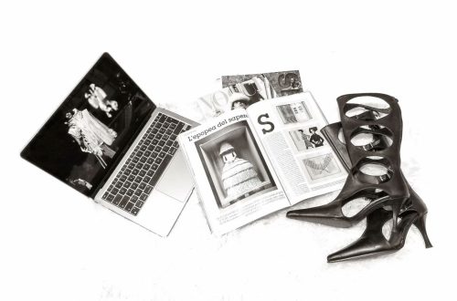
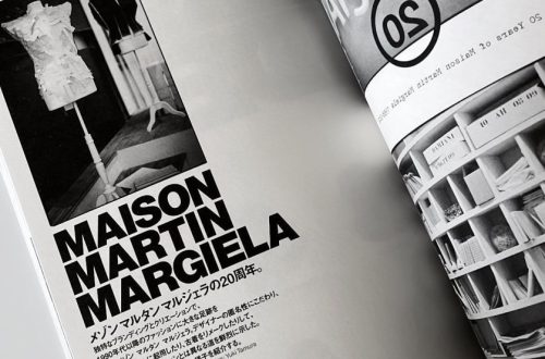
Before actually starting to look at fonts, I did some research looking at other magazines or fashion portfolio and analysed the type of fonts they use. One important aspect I noticed is that most of these use different fonts for: titles, headings and content. Moreover for a successful eye-catching magazine the use of more fonts is essential. Some examples:
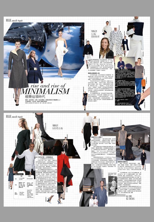
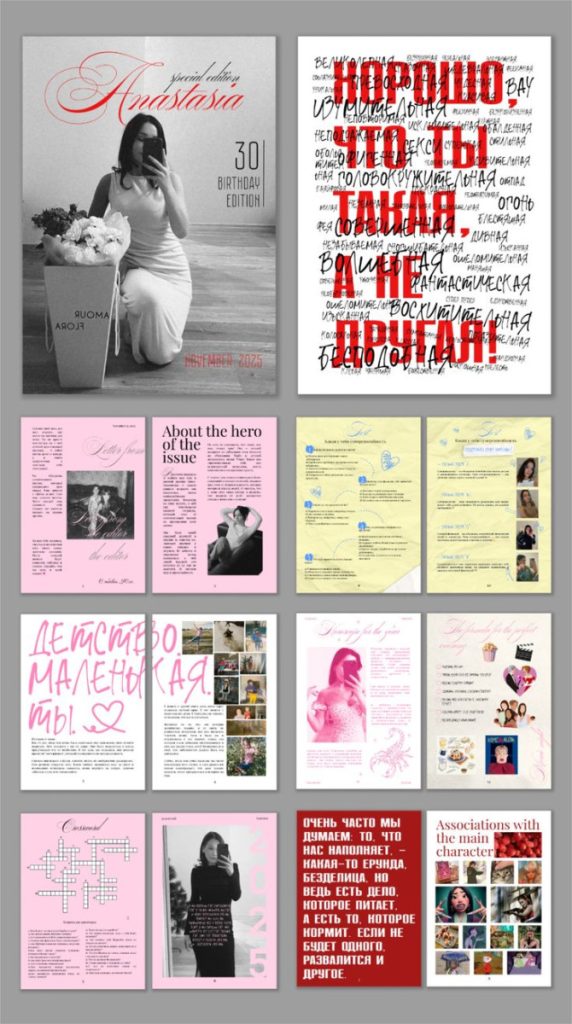
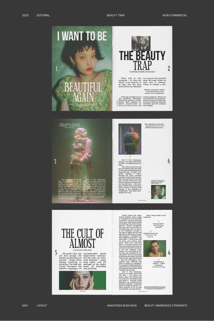
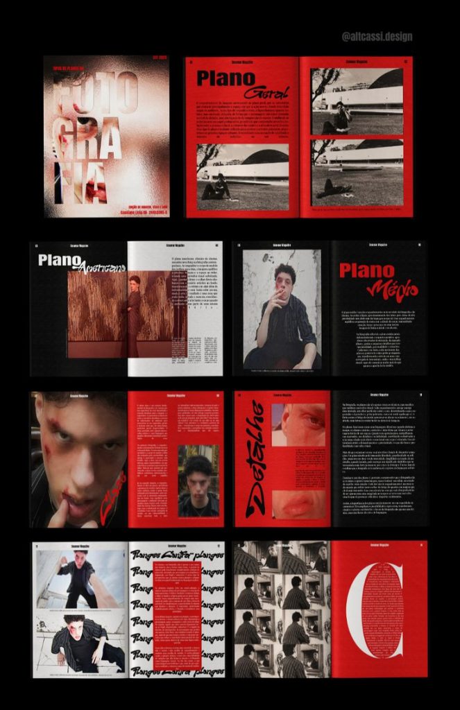
In most of these we can notice that the fonts play a crucial role in the design, each font matches the colour pallet of the overall magazine or photography. In some cases, for titles, fonts may even differ from one word to another
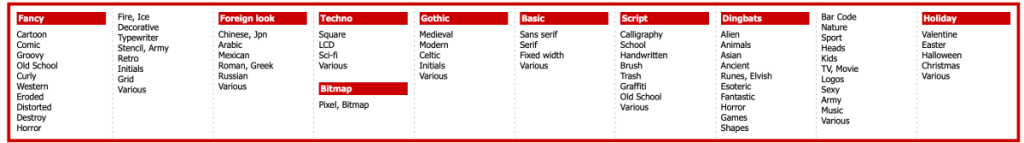
Later, I looked at some websites that offer varieties of fonts, first website I found was this one: https://www.dafont.com. One thing I enjoyed about the website was that it offered fonts based on categories:
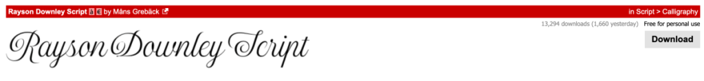
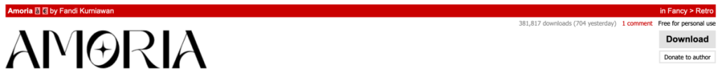
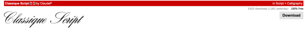
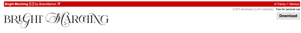
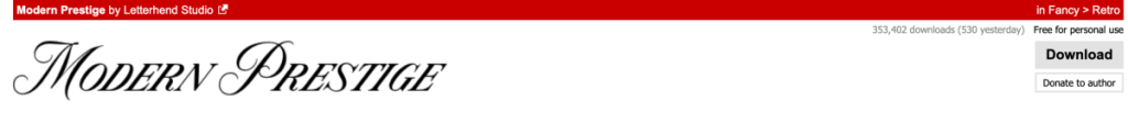
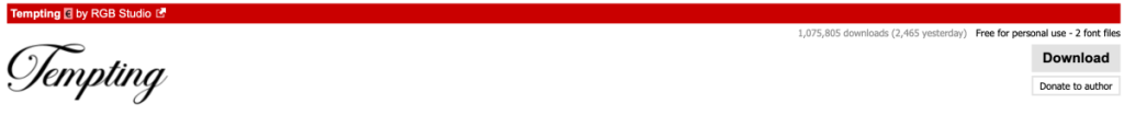
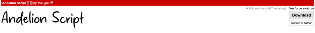
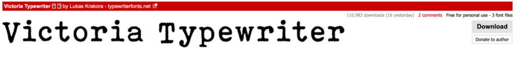
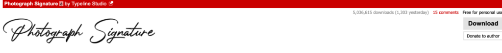
Some fonts that caught my attention were:
For titles/heading:
For content:
For the content text I was actually looking for something more simple and minimalistic which I didn’t quite manage to find here so I took a further look around some websites. In the end the best website for this which I found was https://fonts.google.com/specimen/Playfair+Display. This platform is offered by Google itself. These are some fonts that I liked:
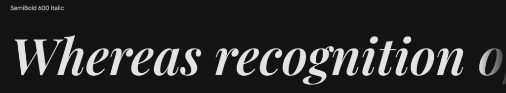
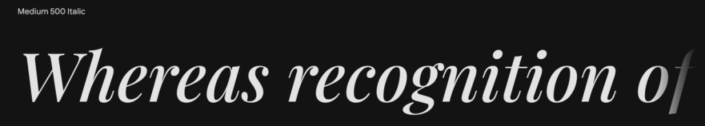


Even though they may look similar each has its own differences and give different messages or aspect.