genre:
The genre of my magazine is “experimental fashion”. It is aimed at Gen Z audiences (14-29 year olds) which are interested in fashion and photography. Lots of topics will be covered even some beauty (makeup), political issues, environment.
masthead
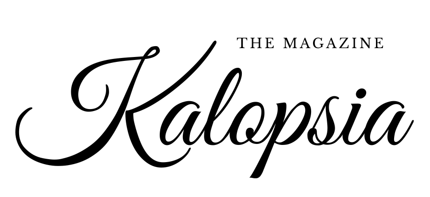
(from Greek kalos “beautiful” and opsis “sight”) is the delusion or pleasant illusion that things are more beautiful than they actually are. It’s used to describe seeing beauty where it might not objectively exist, like an artist’s vision or someone looking back at a flawed past fondly, as seen in song lyrics or video games.
fonts
The font I chose for the headings is “Modern Prestige” by Letterhend Studio as I like the classiness it brings to the magazine, but I decided to also mix it with “Photograph Signature” by Typeline Studio. This will bring some funk into the magazine as different text colours will be used and the fonts may also overlap. For the content of the magazine I will use the font “Medium 500 Italic” because the cursive letters in this font match the headings giving a clean aspect.
visual approach
The magazine has a clean font-wise aspect. At first glance the magazine may look minimalistic however drops of colour or overlapping photography/fonts will add a unique, funky look to it. This will create the perfect balance for the consumer.
colours
I will be using a more neutral colour pallet for the base (negative space) such as black, white, shades of beige and grey etc. However I will use some vibrant colours for titles and doodles around the magazine to fill up the negative space I mentioned before, some colours I chose were “Classic Blue” (colour of the year 2020, as I believe it was a revolutionary year which most people will remember) and Blue Iris (colour of 2008) since this is the year I was born in, and wanted to include a bit of me in my creation.
photography
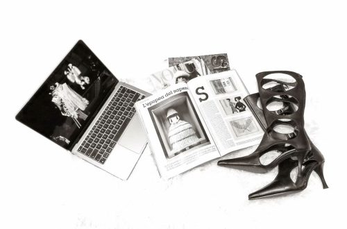
In some cases photography speaks more than words, I want to capture funky, unusual photos to catch the attention of the reader and to really make them analyse the pictures, rather than just looking at them. I hope my photography captures more than just an image but words, messages. I want to highlight individuality and the complexity behind garments.
target audience
The magazine’s target audience is Gen Z (~14-29 year olds) audiences ,as I specified before, focusing on fashion enthusiasts. Since most purchasers of fashion magazines are fashion enthusiasts in the first place, this puts my magazine in a perfect position. I want to make this magazine resonate and really make my target audience think, I believe the best media is the one that makes you think or has an impact/can be talked about, therefore this is what I am aiming for my magazine to be.
table of content style
The table of content will present the articles specifying at what page you can find each one and displaying a small description of each (a few words). This will offer the reader an easy time navigating around the magazine, but also find directly the topic they may be more interested in.
what makes it stand out
Kalopsia will stand out due to its unique genre. It is made to stern questions and create confusion but also send a message. These days people pay more attention to what disturbs them rather than what is pleasant for example, in everyday life. This is how I intent to stand out by creating discomfort with interesting topics.