


I liked both options, the second one seems to fit better inside the space, but in the first one the photo matches the design better. However in both the text looks a bit crowded by the surrounding photos. I did a few more design with the second photo to see how they would look.

The first one I like the title over the photo but not how the text is so close to the edge of the page. In the second the colours match the photo but I’m not that convinced about it combined with the editor’s letter page.
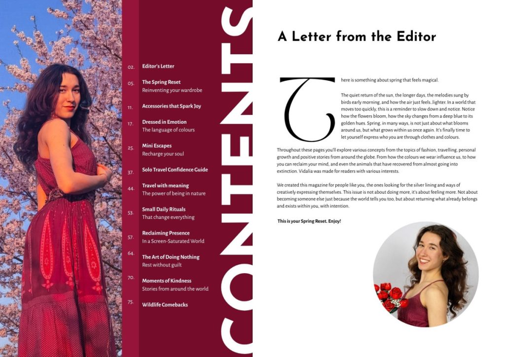
I also tries out a 2-page design, which honestly, just design wise I liked the most, however I wasn’t really sure what to add on the second page so that it doesn’t look empty. In the end, I decided to divide them on sections, which would make reading easier as well. Now I just need to add the page numbers in a way that doesn’t complicate the design.


And this is the final design of the content page: (without the purple lines obviously, those are just guidelines as I worked on the design, and which I used to change the pages from landscape A3 to portrait A4 in order to create the flipbook).
