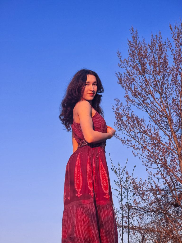
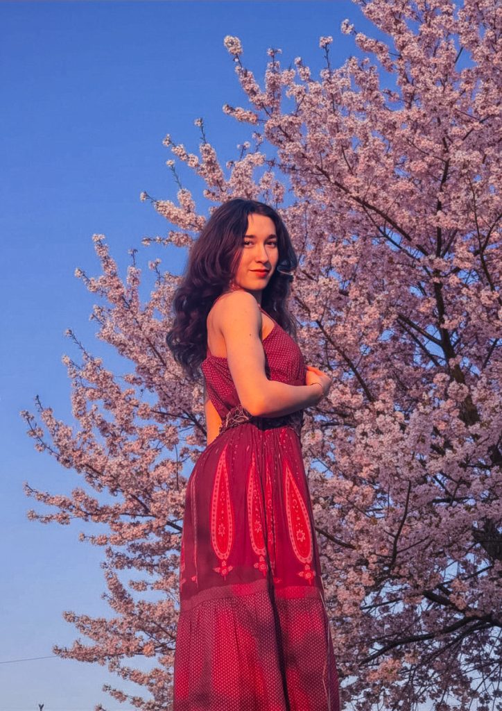
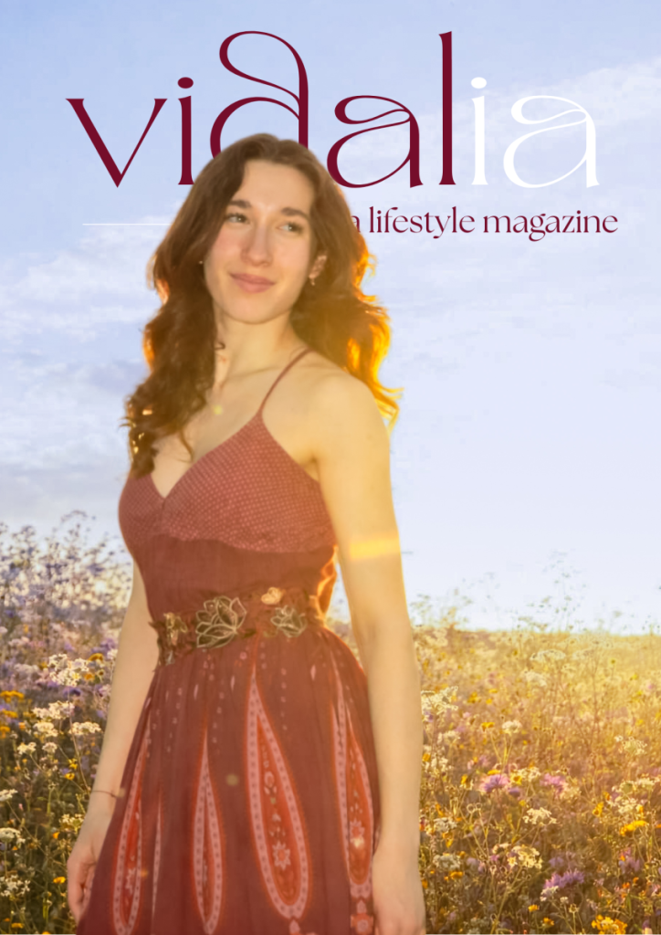
I wanted to create the covers last, so that I would have the entire article before and this would be the completion. But until I had these done, choosing a photo for the table of contents would be complicated, as one of the options was also an option for the cover. First of all, I decided that the photo with the tree behind and the blue sky was too dry, it didn't look like spring at all. So using Adobe Photoshop, and the tools available, I created a tree behind it that literally gave the image life. And I edited the photo further to enunciate the sky and make the flowers more pink.
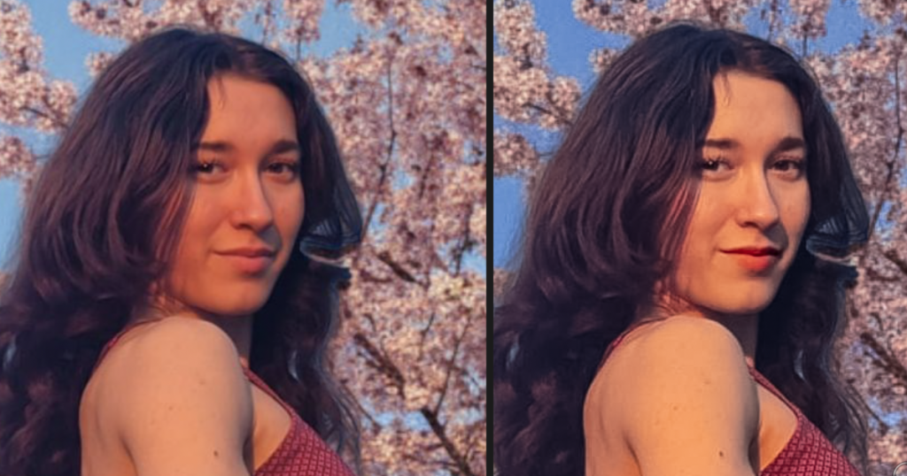
Here I used masking again to recolour the face, as it differed from the body. What I did was brighten the skin and increase the yellow tones a bit, while decreasing the red tonnes which made the face look a bit puffy.
Finally, I was left with these three options: (I also edited the last photo which had dry nature in the back by putting some field flowers instead, also using Photoshop, but this one turned out a little unnatural).
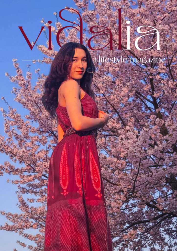
I then asked my friends and family which one they preferred from these options. In total, I asked 11 people, from who was around and my closest friends, and the majority picked the first cover, but there were also quite a few who liked the second choice more, which is why I decided to keep the first as cover and put the second imagine somewhere inside the magazine (most probably the content page). I created two option though.
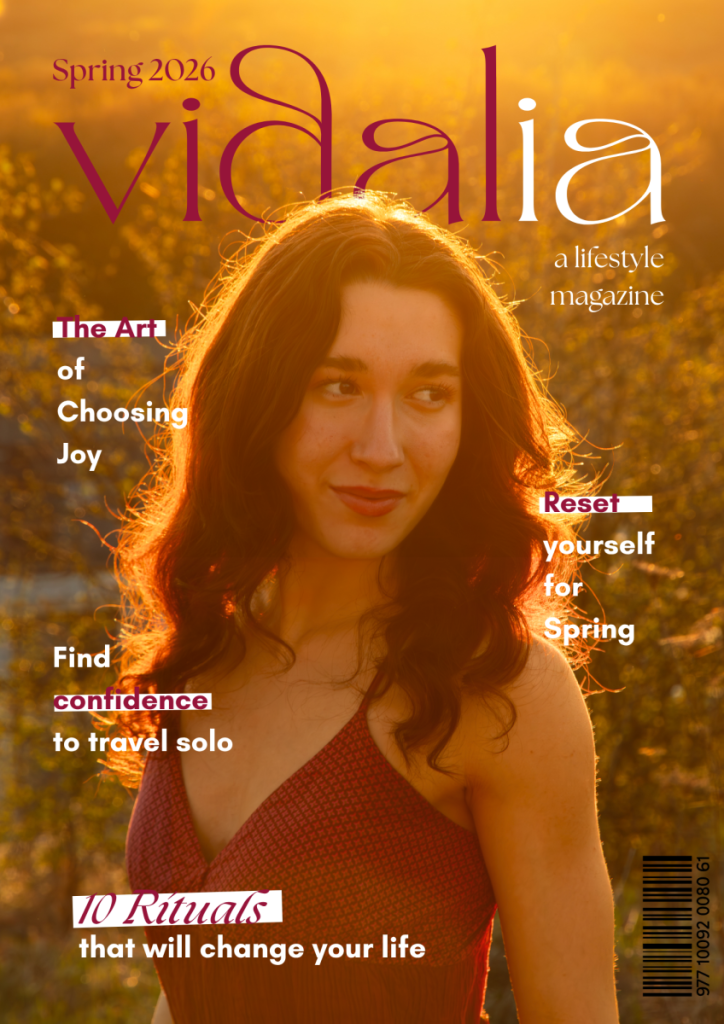
After analysing the photos for around 10 minutes, I made my final choice.
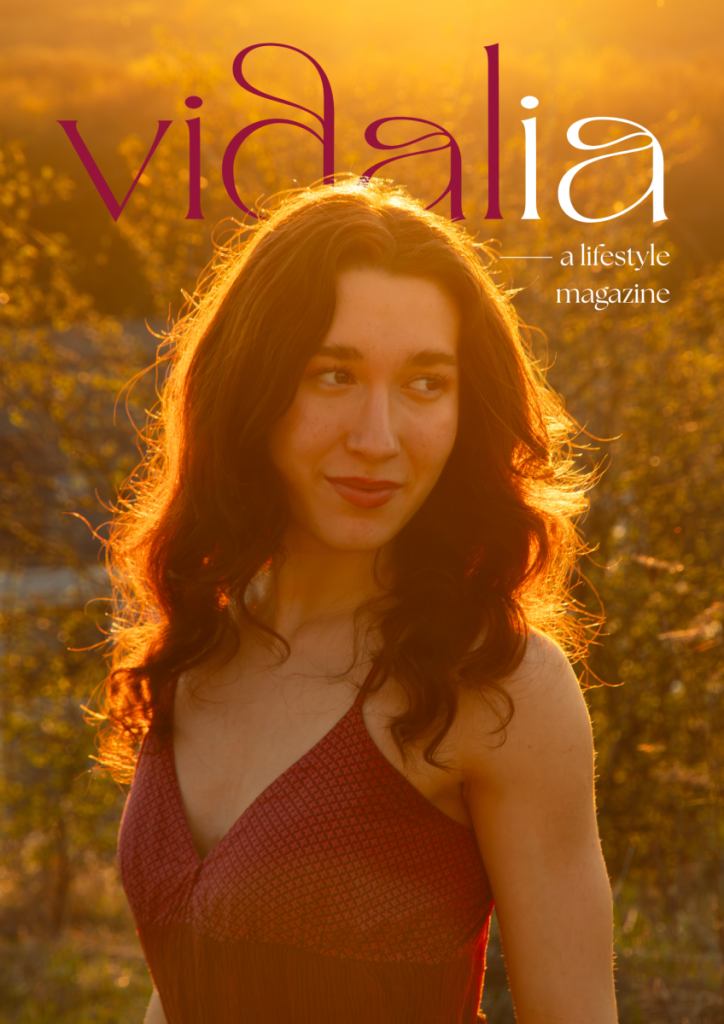
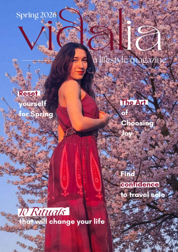
For the front cover the final choice was the golden hour photo, because as composition it just looks more like a cover, the text is clearer, and it complements the back cover. It was a difficult decision, because I liked both, but for the other there was also a chance of people straining their eyes because of the text over the flowers. For cover lines I choose the most interesting topics inside the issue, which in my opinion would attract readers.
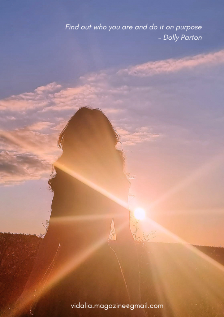
For the back cover I have decided to go with this photo, enunciated the warm and pink light, as well as the blue sky. And the quote "Find out who you are and do it on purpose" by Dolly Parton because it represents by magazine as a whole and what readers are supposed to take from it.For the back cover I have decided to go with this photo, enunciated the warm and pink light, as well as the blue sky. And the quote "Find out who you are and do it on purpose" by Dolly Parton because it represents by magazine as a whole and what readers are supposed to take from it.