The genre of my magazine is lifestyle. It focuses on fashion, travel, personal growth, mental wellbeing, and positive news. All these sections focus on various subtopics and issues, making them relevant and helpful.
Masthead

If you search Vidalia, comedically you will get images of an onion. The word itself is either known as a sweet type of onion grown exclusively in the state of Georgia in the U.S, or a girl baby name. A more abstract or conceptual way of thinking though, is that the onion represents the various layers of life, every emotion, memory, experience. Additionally, vidal comes from the Latin name Vītālis, which literally means life, a reason why it is highlighted in a different shade in the title. It carries connotations of vigor and vitality, historically interpreted as a blessing for long life. So in my magazine it is a representation for the art of living.
Fonts
These are the fonts that I’ve liked the most, and using the site I’ve mentioned in the typography post, they look good together. Josefin Sans will be used as the heading, Muli is going to be the font for the subheading, and the body text will be written in Alegreya Sans. The masthead uses the TAN the Whistling font, which adds a sophistication to the whole magazine. It is complemented by the soft edges and finer strokes of Josefin Sans, which adds an airyness but also classical touch to the pages. I enhanced this with Muli, which will be used italically in the article, as I found that is what fits best. Alegreya Sans is highly readable and offers some balance against the headline font as it isn’t as geometrical, yet still from the same family (sans).
Visual approach
The magazine will have a clean aesthetic, but at the same time a colour coded one. It should look visually appealing and eye-catching. Overall it will be minimalistic as the photos will speak for themselves (except in the stories around the world article where there will be more text). For the feature article itself I was thinking of adding geometrical shapes of certain colours behind the photos, and changing the text colour of a quote into the colour the page represents.
Colours
So the magazine will be divided into pairs, two pages for red, two for pink, two for blue and lastly two for yellow (I am still considering whether to add green or to take out another colour and lower it to 6 pages). The shades will be spring coded, so lighter soft shades of each colour that blend nicely into each other as you move to the next page.The rest of the magazine will have a spring colour palette as well. Black and white obviously, then sage green, watermelon/flamingo pink, and soft yellow. These paler colours make the overall design look more complete while not overcrowding the photos or text.
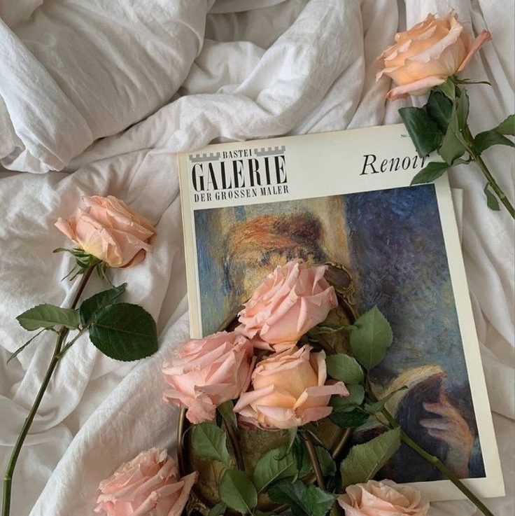
Photos style
Photography is a crucial part of this magazine, so they have to tell a story and be unique either through composition, colours, style, or unique poses of the model. They will be expressive and encourage individuality, with beauty seen in the big picture and well as small details.
Table of contents style
The articles will have a main heading, and for some, where I feel extra information is needed, or I had the idea of another catchy line, I’ll add it below in a lighter shade. The page number will be beside so that navigation is easier.
Target audience
The target audience is younger people, aged around 17-30, with the focus being on women. With the last section of the magazine I think I would attract people above that age range as well, which is an advantage. But the main thing I wish for is people feeling good while reading, resonating with the content and also getting new ideas.
What makes it stand out?
Vidalia Magazine is made from the perspective of a young person for an audience of young people, this way the content can relate more to how the audience thinks, feels, and understands. The style, both in terms of writing and page design is made to attract this audience. This magazine also focuses on various topics less seen, instead of global trends it focuses on individuality and promotes self-growth. There’s topics related to confidence and wellness in such a way that people wish to grow but pressured by unrealistic expectations that the world usually puts on us. The magazine offers positive viewpoints of life and the world, because there are enough negative news sources out there and if we would only focus on those we wouldn’t be able to fully be grateful for our lives.