For this post, me and my time, decided to take the time to look to choose a font for our title, create the credits, and design a logo for our team. This was only possible because our ideas had finally gained shape after the start of the filming, so we were all able to be on the same page. We decided each to take charge of one of the three and get that part done, of course with the constant input of the others.
Fonts
For the fonts, Luca was in charge. He looked at the title that we drew on the storyboard for inspiration, and used that to find the perfect title font.

As a reminder, this was the font used in the template. The font is called Playfair Display Italic, and was used for the title itself. Our names are written using Playfair Display regular.
Starting from that, we knew we wanted something elegant but also a little bit dramatic, and definitely with italic tilt.
From this we looked on the Google Fonts website at similar fonts with a more dramatic effect. We looked at fonts with a fancy feel that had formal calligraphy.


After looking at these two we decided that the one on the left was too thick, so we took into consideration more options.
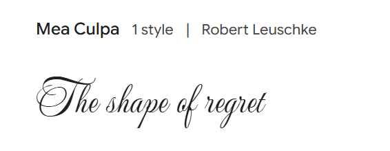

Ultimately we decided upon the title font “Ballet” as we found it the most dramatic and formal.
Because we had no superimposition in our film opening, no other font had to be picked.
*We ended up adding the movie title in the chosen font, to the begining of the film opening, with a white color.
Credits
For the credits, I decided to look into the templates that were available on Canva to get a better idea of what my options were. I knew I wanted a high contrast between the writing and the clip in the background, and I was also firmly convinced that the traditional rolling credits with a black background were not what I envisioned.


Upon browsing all the different types of templates, I realized that none of them really fit the vision that I had in mind. Nevertheless, i continued to look through them and finally came across one that i deemed to have a lot of potential.
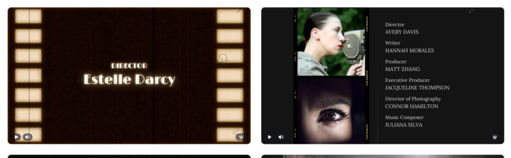
This is the initial template video. In order to customize it I changed the font it the title to something as similar as I could find to the “Ballerina” font on google. I ended up finding a font called “Parfumerie Script” which looked very similar.

After that, I took the liberty to fill in all our roles, along with our names. And for the background video I decided to use a clip from the second scene to tie it all together. I didn’t like the color of the clip so I changed it using a black & white filter. I also changed the color of the title text to a dark red/burgundy, to perfectly contrast the black & white background. I decided to change the color of the rest of the text to white, however, I decided to keep the color of the dotted lines burgundy.
Here is the final credits video:
We ended up using this credits video only for the preliminary work, and created a more simple credits video for the final film opening, as we wanted each title to be on beat with the music that we chose to include at the end. We ended up using the first template that I showed during the template browsing, and we just changed the roles and the fonts to something a bit more subtle.
This is the original template. We ended up changing the fonts from “March” to “Hello Paris”, and we left the role font as “Linux Bolinum”. For the “Special thanks” slide we used the “Hello Paris” font for the names, while using our title font for the words “Special thanks” as it would tie in the title as well.


We chose to do the credits as a presentation rather than video as we wanted each slide to match the beat of the song. This is the end result:
Logo
For the Logo, Mara was the one in charge of making it. We all debated what our name would be as a production group, and we decided on using our initial and tying them into one singular word instead of using an acronym. Our initials are S, M and L so the word that immediately came to mind was “small”. We decided, however, we wanted our initials to be the main focus so we decided we should either make them a different color or make them in caps.
Mara started our by looking at some Canva templates and changing the colors and words on them to give us a few different options to choose from. These were the original templates:


She changed them to fit our group name and color scheme. The color scheme included dark red, black an off white to fit the colors in our film opening and the vibe of our group.


Upon discussing further, we decided that we liked the last option the most, as we really liked the font, and the colors worked perfectly with it.
For the background for our logo, she looked at different black videos, and just decided to stick to a black background for the video. She added the main logo with a typewriter animation, and added a burst effect on the “film production” part. The final video looks something like this:
Leave a Reply