For the film opening I made a mood board for each scene in the film opening based on the color scheme that we aim to use. Our film opening is greatly based on the technique of color grading and how to convey emotions using colors.
Color grading is a creative choice of producers to use color to convey feeling, atmosphere or theme to the audience by manipulating and adjusting the colors in visual imagery. In media it is often used to portray emotions and narrative shifts. Warm tones typically are associated with happiness, comfort and intimacy, while cooler tones can convey the feeling of isolation, sadness or tension.
Using color grading can allow producers to guide the viewers’ emotional responses without the use of narration or dialogue.
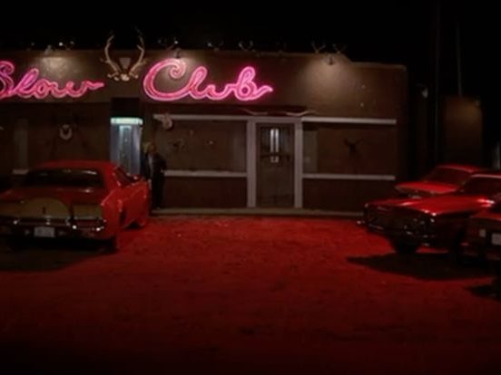
The movies that inspired me, when researching color grading will be presented throughout this post, to encapsulate the creative inspiration that I will use for the film opening.

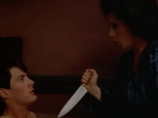
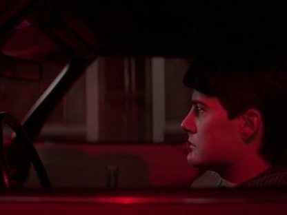
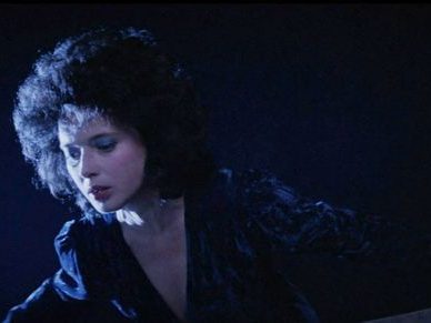
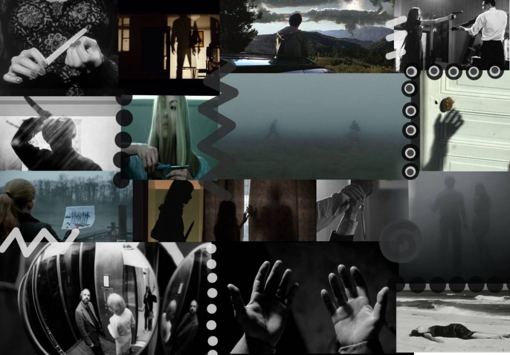
In the film ‘Blue Velvet’ by David Lynch, color grading is used to show duality, and reinforce normality with covered darkness. In the beginning of the film, Lynch uses highly saturated colors, like blues, reds and white, to paint a perfect picture of suburban America, creating an almost artificial looking environment. This conveys a feeling of safety in the town of Lumberton. However the high, artificial saturation gives a sense that normality is not authentic. Throughout the film, Jeffrey becomes aware of a criminal world, which causes the color grading to change drastically. Lynch used low-key lighting, strong shadows, and cooler, darker tones, especially blues, blacks, and reds to convey a sense of unease. Interior scenes, especially the ones including Frank, are heavily graded to appear claustrophobic. The darkness visually represents moral decay and the corruption that exists beneath the town’s cheerful exterior.
The prominent use of blue lighting is significant, as blue often symbolizes sadness, and emotional detachment reinforcing the disturbing world that Jeffrey enters. On the other hand, red lighting is frequently associated with violence, and desire, emphasizing moments of tension and accurately portraying Frank Booth’s aggressive dominance.
To conclude, color grading in Blue Velvet is very important for the narrative. Lynch uses exaggerated contrast and strong darkness to clearly show the contrast between appearance and reality, hinting that darkness persists even in the most normal and bright places.
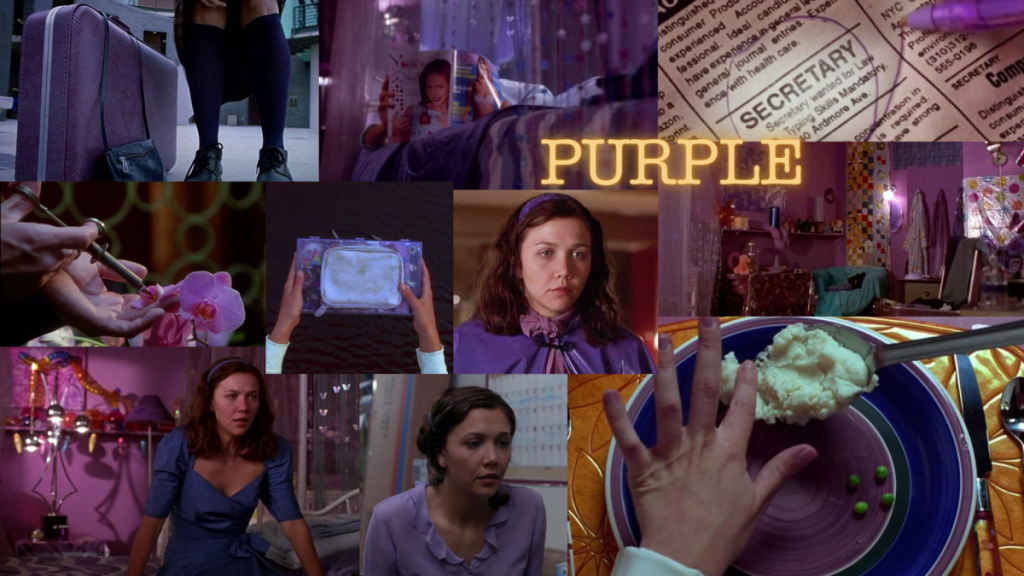
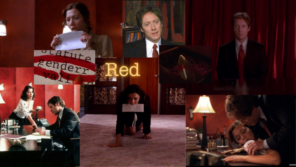
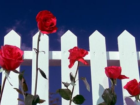
Purple– is repeatedly associated with Lee Holloway, she is often seen wearing purple clothing, and her bedroom is decorated in lilac and lavender shades. This visual connection extends to Mr. Grey, especially through his orchids. Purple visually ties Lee to Grey’s orchids, symbolizing her growth and transformation under his care, like a flower being nurtured. The color purple deepens in the film’s final scenes, signaling Lee’s shift from being controlled by someone to being a person who is cherished and cared for, suggesting self-acceptance. The color also signals Lee’s journey out of isolation and self-harm, towards feeling “beautiful” as she becomes more comfortable with her desires and identity. The use of purple in the mise en scene helps to build an intimate, somewhat constrained atmosphere that reflects Lee’s internal state.
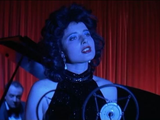
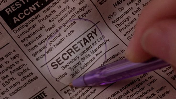
Red– first appears most notably through the use of Edward Grey’s red pen, which he uses to circle Lee’s typing mistakes. This pen acts as a visual cue of control and authority. The brightness the red against otherwise muted colors emphasizes each mark that Edwards makes, drawing both Lee’s attention and the audience’s to the tension and rules of their unconventional relationship.Whenever red appears in the film, it stands out as an intense, emotional thing in the controlled and limited mise en scene. The deliberate addition of red cues, emphasizes moments of great psychological intensity, often times signaling desire or confrontation with personal boundaries. For the audience, these rare red elements become denotative of moments that show a change in their relationship or the situation. Red operates as a powerful tool to disrupt the visual monotony, and marks key shifts, signals the power dynamics at play, and presents the combination of danger, attraction, and control that underlies the central relationship.
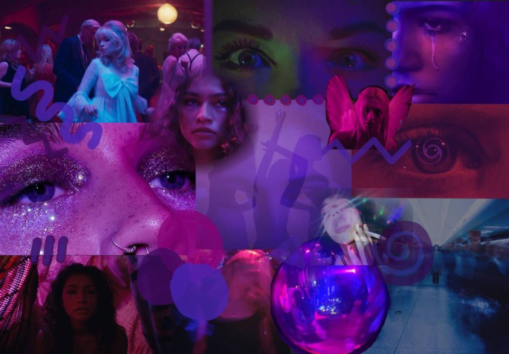
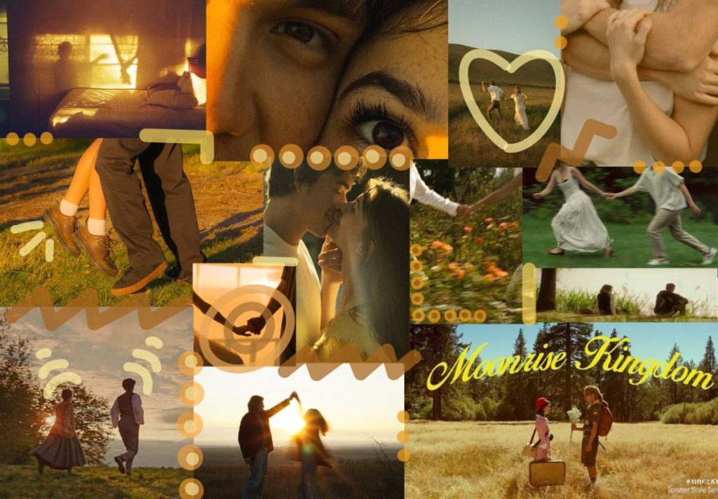
For our film opening I made a mood board for each scene as they will all have different color schemes as a result of color grading.
Scene 1
Scene 2
Scene 3
Leave a Reply