
For his post, me and my team decided to focus on choosing a font for our title, design the credits and create a team logo. This was the next logical step due to us already having the raw montage and all of our scenes filmed and we needed to start editing. We decided to split the tasks with each one of us doing one and at the end present our options to the others, in order to get work done more time-efficiently.
FONTS
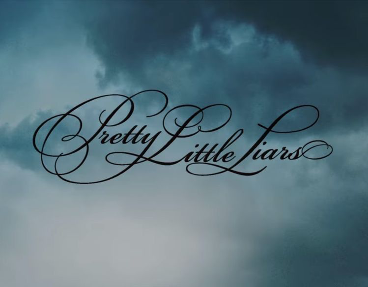
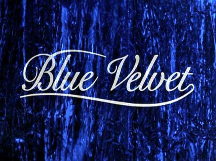
For the fonts part, luca was in charge. He started by looking at the storyboard font we picked in order to choose one similar to it. We decided that we needed something elegant and dramatic so we looked at some other fonts used by popular movies and choose the ones we wanted to use as inspiration:

From here we decided to look on Google Fonts and choose one with a similar vibe and calligraphy. We wanted a dramatic looking text with thin lining. This is what Luca found:
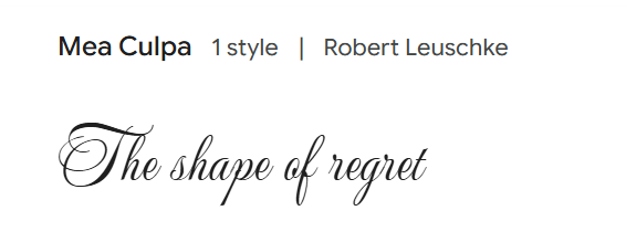
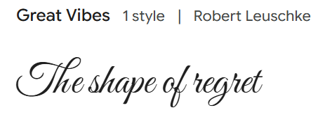
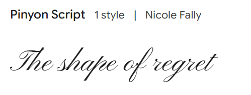
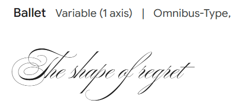
Upon looking at these choices we decided to stick to ballet. We thought the rest were a bit too thick and not as elegant as we wanted to. Additionally we loved the calligraphy of the letter T and the calligraphy for the letter F.
CREDITS
For the credits stela and i started by looking on canva at templates in order to get a better idea of how we wanted our credits to look. As a team we decided to further push our psychological thriller genre by having a big contrast between the background and text. We also decided that we wanted our text to be red.


From this point it was up to Stela to decide one that looked the best. However none of them fit our vision. However we continued to look though the templates and finally found one that fit our vision the best:
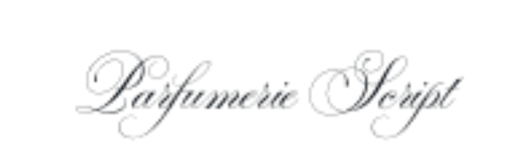
Upon making our credits, ballet was not a font option on canva so we opted for a similar font that existed only on canva, Parfumerie Script.
Finally, Stela added a scene from the field as the background and put it in black and white, coloured the text and added our roles at the bottom. Here is the final credits:
LOGO
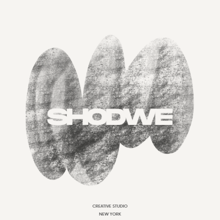
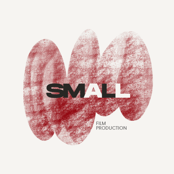
For the logo I was the one in charge of designing it. We collectively decided to use our initials and do wordplay for our production company name. Our initials are S,M and L and the first word that came to our mind was small. We decided that, in order for our initials to stand out we would either colour them differently or use caps for our initials. With that in mind i started by checking some canva templates and found 3 possible options:
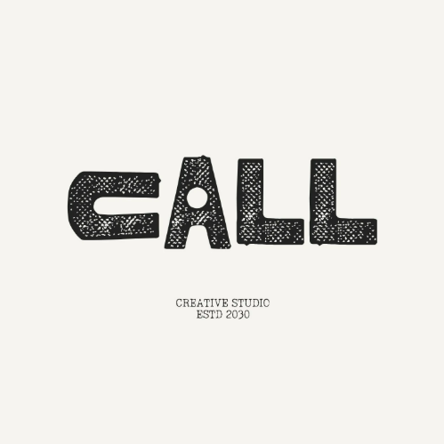
Black White Vintage Grunge Rough Square Creative Studio Call Logo
Monochrome Grunge Creative Studio Logo
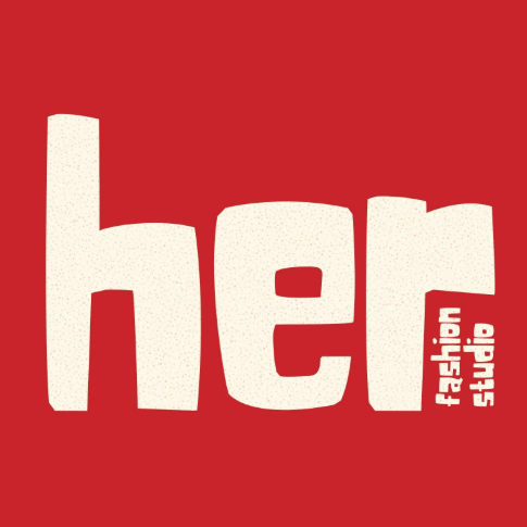
Red Bold Fashion Studio Logo
After selecting those I went on to choose our production team’s colours (red, white and black) and change it to our name (SMaLl film production). These were the results!
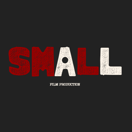
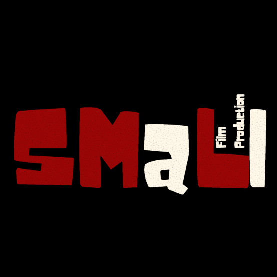
I presented my work to my colleagues and we decided that the last one was the one we were going to use since it was the most unique and one and the one that highlighted our initials the most.
After deciding on our preferred production logo, I went to put it in a video format so we could use it at the end of our film opening. I added the typewriter animation to our logo and the burst effect on “Film Production” in order to make our logo more dynamic and eye-catching.
After this process we are very proud of our fonts, logos and credits, and understood that even though this seemed like an easy process, it was a lot of work behind the scenes.