

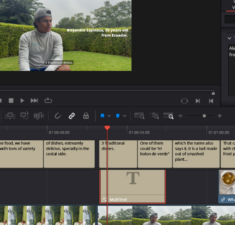

For the subtitle, I needed something that wasn’t too thick but also not overly subtle. I chose Open Sans because it’s easy to read, straightforward, and clean. It doesn’t have excessive curves or other embellishments. In some of the B-roll and in two out of three interviews, I had trouble reading the subtitles, so I decided to use a darker background to ensure that both I and my audience could read them easily.
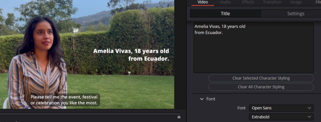
To introduce each character or interviewee, I used Open Sans in extra bold. This choice was intentional to make it more noticeable and capture my audience’s attention. This way, people can see and read it more easily, enhancing their understanding.