For the title that will be “Ecuador the unsung realm.”
I decided to give it that name because it is an amazing place that is not too well-known, therefore an unsung realm.
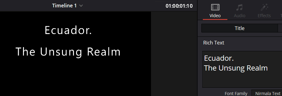
This font is called “Nirmala text.” This one looks nice, it is pretty simple, and it would fit the documentary.
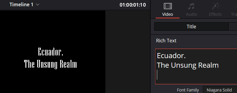
This font is “Niagara solid”. I like how it looks; it looks clean and fits into a “nature” font.
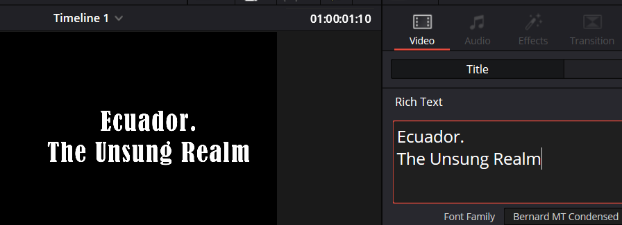
This one is called “Bernard MT Condensed.” This one is a little more dramatic; it looks nice, and it fits my ideas.
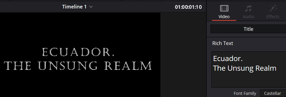
This one is called “Castellar.” I really like it because it is a little dramatic, but it also gives vibes of a more active documentary, which is what I am trying to do.
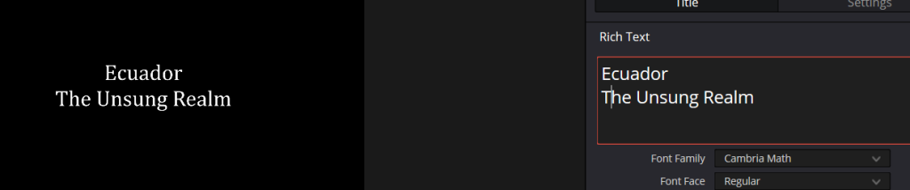
This font is called “Cambria Math.” I believe it fits best. While it’s a bit more subtle, it is clean, understandable, and complements my Instagram and social media page well.
So out of all of them, the ones I liked the most were the last 2, “Castellar, and Cambria Math” because they give a more active and fun energy, also fit the name that I gave it. If it were a longer documentary, I would have shown more nightlife and some other activities that would be crazy and fun. But that is only for the title. Out of both options, I chose to use Cambria Math because it is easier and looks better when trying to match it with my social media page. Now for the subtitles.
For the subtitles, it was a litle easyer cause, from what I researched and say myself, is that subtitles are simple and easy to read no matter the genre of the film/documentary.
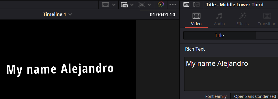
This one is called “Open Sans Condensed.” Even though it is clean and easy to read, I think it is too thick, making it a little too attention-grabbing.
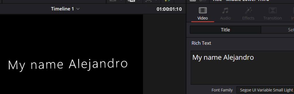
This one is called “Segoe UI Variable Small Light.” And I really like it, it is clean, easy to read, and it looks nice.
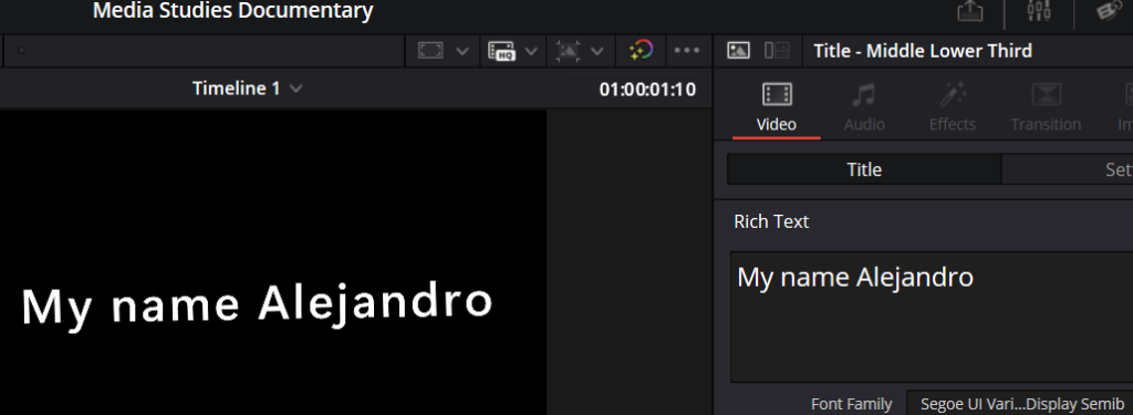
This one is called “Segoe UI Vari…Display Semib.” This one looks nice, it is easy to read, and I really like it.
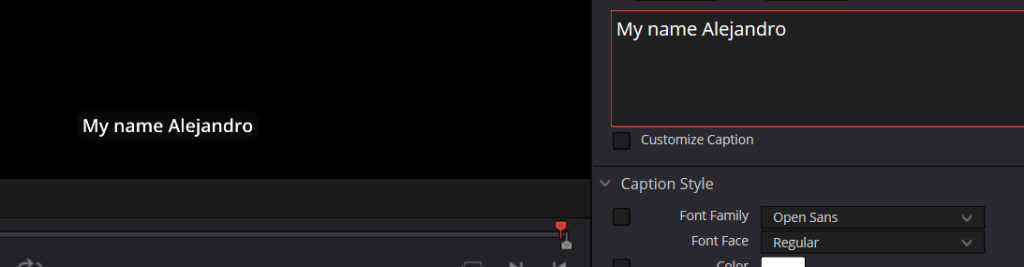
This one is called “Open Sans”, and I liked this one the most because it is clean, understandable, and perfect in both thin and thick.
Out of these 4, the ones I liked the most were the 3rd one and the 4rth one (“Segoe UI Variable Display Semib”, and “Open Sans”), and out of these 2, the one I liked the most cause it looks more balanced is the 4rth one (“Open Sans”) because I feel like it is a perfect balence of understadable, and how thick it is. Therefore, being the one I have chosen to use.