Feature article: 203 photos in total

From the selection of favourite photos I’ve chosen before I have to narrow it down to even less, around 3-4 photos for each colour. I started by dividing the best photos into different coloured sections, this way not only would it work more efficiently organisationally wise but it would be easier to compare them and choose the best suited ones.


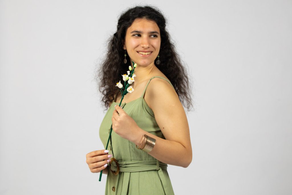


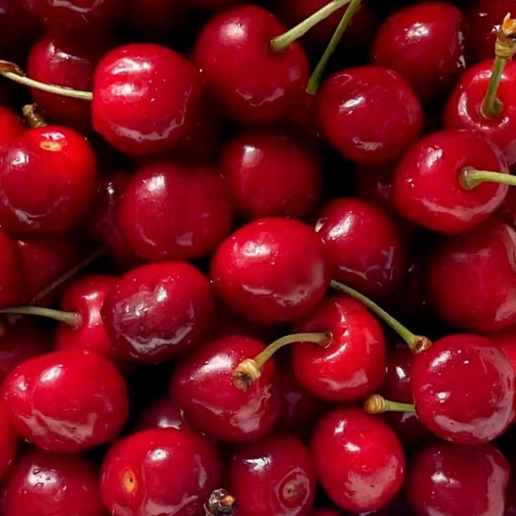
The selected photos are meant to reflect the emotional meaning behind each colour. Red is confidence, boldness, beauty and love — which is why the props include a perfume, lipstick and red roses. Pink is softness and femininity, the flowers in her hair further enunciate spring. Blue is grace and going with the flow, explained by the almost ballet-like pose. Green is growth and power, and yellow is optimism, which is why the expressions are so sunny.
The model’s postures and expressions therefore match the colour they are wearing. I asked myself this question whilst making the selection. Natural, unforced, and bright photos align more with the concept, that was also one. of the criteria regarding which photos will remain.
The strongest images will be used as full-page (or almost) visuals to fully emerge the reader. Others can be placed alongside text, to support the idea.
In therms of editing, the goal is to keep everything airy and true to the spring atmosphere. This can be done by increasing brightness, softening contrast or working with warmer tones. Colours can be enhanced but not oversaturated, I want the shade to stand out but still look pleasant to the eye. The editing will be consistent throughout all photos, so that the overall layout is cohesive.
Cover: 195 photos in total (including behind the scenes and just silly ones)

The cover may be the most difficult one to choose, because from over 190 photos I need to select only two, one for the back cover and one for the front cover. I’ve narrowed it down to these options.
A combination of the front and back cover. For the front cover I want the model’s face to be visible, and her to be the main focus. Although unfortunately the flowers didn’t bloom yet, the golden sun brings the spring tone. For the back cover first option is the one with the sun again but the figure is dark, I like this since it gives some mystery vibes and at the same time suits the topic entirely. It also complements the front cover in terms of light and style. The other would be with the intense blue sky and as back cover the photo laying on the grass as is symbolises grounding, and they go together well.


