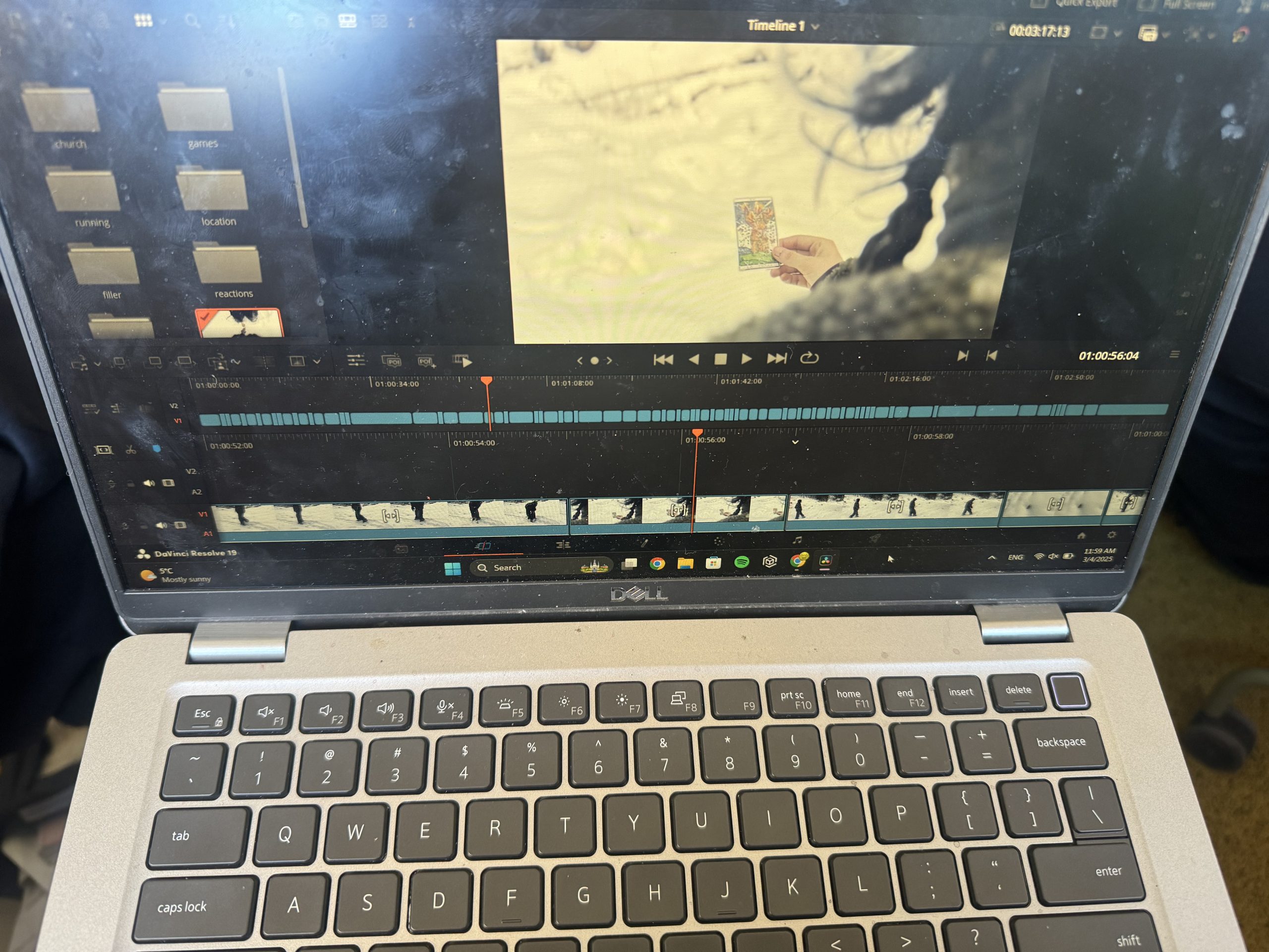
From the ~100 clips we captured, I first selected the final few that were going to be used for the film opening. I used DaVinci Resolve to edit the clips together. I then saved the sequence and colour graded the whole film opening, mainly highlighting the blue tones of the snow and decreasing the saturation on the shots from after the introduction (after the scene with the clowns).
I chose to highlight the blue tones in order to make the film appear more “cold” visually, to symbolize both the physically cold environment the characters are in and the unknown, hostile nature of the situation. I turned down the saturation in order to further represent the negative feelings the “victim” character is experiencing. For the ending scenes, when the protagonist is back home, I attempted to add a “haze” to the footage, to invoke feelings of disgust, fear, sickness.
I used the following editing techniques:
For the beginning and walking sequences- action match
For the scene where The Victim (present) witnesses The Victim (flashback) gambling away her fate- eyeline match, as well as crosscutting
For the running sequence that follows- crosscutting, flashbacks
For the ending of the church scene- jump cut
For the text, I could not find a way to load the “Blackcraft” font we originally decided on, so I compromised and chose from the fonts available on DaVinci Resolve.
Tempus sans ITC for the title
Symbola for the credits.
I chose the first one because it still had that natural, yet still sort of eerie… kind of “scratched in” feeling. I chose symbola for the credits because the first font was not visible enough for my liking, so I settled for one I felt had a similar vibe yet clearer visibility.