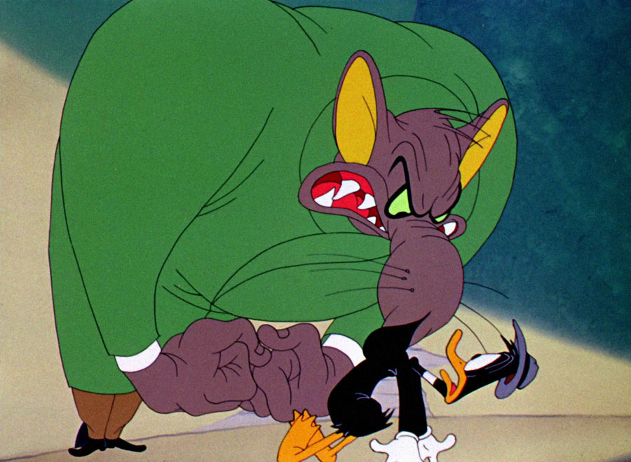
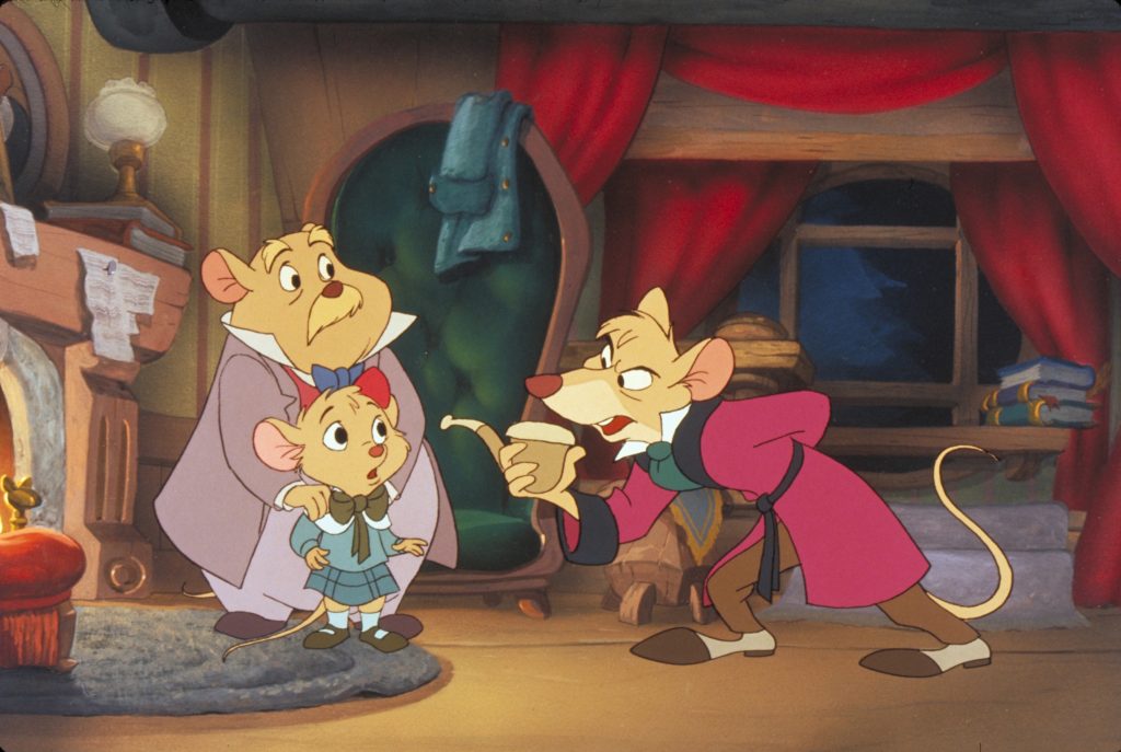
So, “Rabnulf The Lagomorph” is about a brutish bunny rabbit who accidentally meets the heir to the Lion throne after beating the life out of a poor Panther who tried to prey on him earlier. Oolievaar, a stork who was misunderstood as another predator also gets roughened up Rabnulf and would try to get the royal cub back once the opening ends.
The opening is predominantly influenced by the Comedy genre but certain scenes nod to Action. Drama can be slightly seen in the more excessive emotions that the characters display.
●
Identify conventions used and explain why:
Well, the opening is chock full of cartoon conventions. The easiest ones to spot are the squashing and stretching of the characters, exaggerated sound effects and noises that metaphorically resemble the visual action (Panther coming to stop is accompanied by car brakes sound). Also, some expressions anre unfortunately be clichés (Rabnulf gets an idea and a lightbulb appears over him).
●
Identify conventions challenged (if any) and explain why:
I wanted to try a more atmospheric tone for this opening as I thought cartoons are sometimes deemed as just childish colour jargon. I tried to mix more traditional drama into the video to work against the action, hopefully making it more funny to watch. Some of the jokes are intentional subversions (Rabnulf crafts a key from a carrot but simply breaks the door with his fist after with no explanation).
●
Identify social groups represented, how, and why:
My characters aren’t meant to represent deep social meanings as it doesn’t match the expected tone. However, some traits naturally sprouted from them that resembles actual social groups.
Rabnulf Is your average Tarzan/Feral Child character that is dissociated with average societal etiquette, speaks incorrectly but is well meaning despite having anger issues. His behaviour became rigid due to excessive fighting, stripping him into an incredibly apathetic person, only reverting back to his primordial state if he encounters a nostalgic aspect of his life.
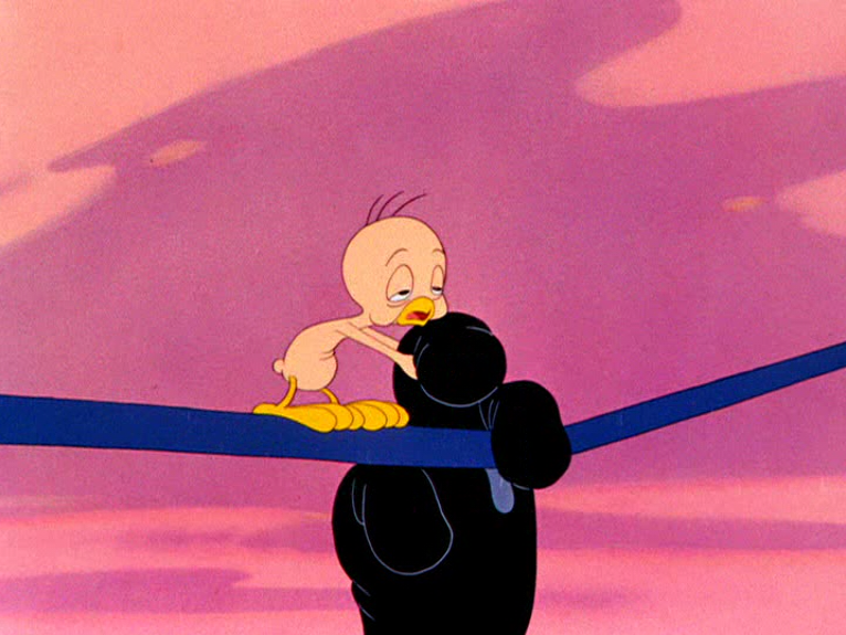
Oolievaar represents the hard worker who tries their best to earn the fruits of their labour but ends up holding petty grudges. His polite pushover-ness but condescending behaviour juxtaposes the personality of Rabnulf’s. He has to endure cultural stigma as Rabnulf thinks all storks are criminals as one killed his parents.
The royal cub is the future child of the king and queen. Their socially created value makes them unknowingly important. If someone were to ever lose the baby, horrible punishment would probably follow.
Neckfeathers is an unapologetically evil bird disguised as a natural predator. He prefers to have a Keto diet but still eats victims for the fun of it.
The King and Queen are the rulers of the savanna and the powerful yet sometimes blind eye of law. They give punishments and ask questions later (or never).
The Panther is just a hungry guy. He became a vegetarian offscreen after the events of the opening.
●
Identify issues represented (if any), how, and why:
The production had plenty of issues. Firstly, revisions had to be made for some scenes with emphasised animation because the movement didn’t flow well. I tried to keep the 180 degree rule in mind as it doesn’t naturally occur to me yet. Sometimes, finding the proper sound for each action was difficult. I also had to remember many small status details for the characters in order for consistency to not be lost.
Furthermore, there’s a bountiful size of animation frames that had to be drawn. It’s obviously my most ambitious animated project as of 2026 simply because no past works can match it in size.
●
Conclude on impact of conventions/representations:
.
●
Restate product & target audience:
The target audience I expect “Rabnulf The Lagomorph” to achieve would probably be older kids (around 10-14 age range) if the work would ever get popular.
In a utopia, the film’s audience would be animation enthusiasts like myself but realistically speaking, it’s probably going to be little kids who randomly clicked on the video when watching something like YouTube (that is if the algorithm works with me).
●
Describe target audience & how product engages them (content, style, etc.):
I hope others might be influenced by the video if we’re speaking on a production standpoint. I would like to see other cartoons that actually try to act like cartoons. It would make my day to observe people sharing their own animations and ideas with me, all under the umbrella of making storyboard driven work.
Nevertheless, I wouldn’t like it if kids walked away from the video thinking that hurting others is good. I hope they have enough brain to not replicate what they saw in the opening at home. I can already imagine angry parents telling me “I left my child alone with no supervision and they watched your horrible film! They’re wresting storks now because of you!”
●
Explain realistic distribution methods & why suitable:
YouTube and Vimeo. I doubt a company like Disney would even bat an eye.
●
Conclude on how audience/distribution helped you make choices in terms of production:
Not much, really. After doing the questionnaire, it occurred to me that it would be better if I do what I like rather than do what others like. Anyways, most of my work comes out better if I actually care about it.
If I could be pragmatic for a second, I don’t intend for the cartoon to gain interest. I don’t think I’ve reached that point in my life where I can proudly display my work because I still have a few knacks that I need to work out. I honestly think it’s ok if this is just a personal project that only you (the evaluator) sees.
●
Acknowledge skill development:
As gruelling as the process was, it made my love for animation even BIGGER and it reaffirmed my wish do dedicate my life to this medium, even if some of my drawings are still a little gauche.
I feel like this project helped me realise how important it is to plan every step in the cartoon beforehand so I don’t lose myself in the bigger details. With that being said, I kept putting new faces and joke ideas into the cartoon long after the initial development process ended.
I also feel like my animation knowledge improved a little bit. You can see some pretty janky and clumsy work in the opening but I feel like I’m doing a better job to implement real physics into the character’s movement.
●
Describe initial skill level:
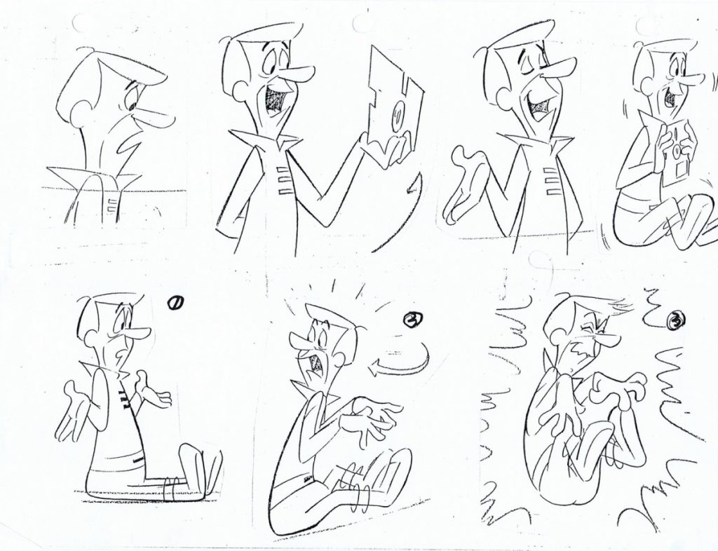
I had a decent grasp on drawing cartoons as I spent most of my life doing so but only now do I feel like I understand why certain characters change design after the pilot and first season. Eventually, I subconsciously started changing Rabnulf’s proportions to make him easier to construct and therefore, easier to animate. I created this model sheet to express my ideas on paper.
If I ever wanted to keep Rabnulf’s design complexities, I first had to understand what MADE his appearance so complex to begin with. That’s where this dandy sheet helped.
●
Identify 2-3 key skills developed with concrete examples:
1) Faster drawing time. This is necessary to be developed for a cartoonist as it is expected of you to draw the same character on multiple occasions quickly.
2) (Slightly) better animation. I think I can time my drawings a bit better and I can emphasise the impact of a movement when needed.
3) Finally, I think I’m a bit better at looking over shots and form through the Big-Picture. I’m starting to be more attentive to how forms and layouts work in tangency, treating every character and background as if they were made to affect each other.
●
Discuss challenges/solutions:
Animation and drawing size is obviously a challenge. The only way I can and could solve this problem is by learning and working even harder.
If only I could properly fit the animatic into the 2 minute time slot…
●
Explain impact on product quality:
I’ll be frank with you, reader. I’m aware that the quality of the animatic isn’t the best (no colour, poor animation, questionable design choices).
It’s interesting because I like to think of myself as having an unhealthy ego, but this opening made me really respect my cartoon heroes even more, now that I know how hard it must have been for them to get thorough the same hardships I face now, but still create masterpieces.
I’ve been humbled and I’m sure that I didn’t even scratch the surface for the potential of cartooning. But, maybe that’s a good thing. Theres plenty more for me to explore and learn about this incredible domain. Chances are, if I stick by my guns, I will never run out of reasons to keep improving.
●
Briefly mention future application:
My experience with Rabnulf’s opening makes me really look forward to what the future has in store, regarding my journey in film.
If I had to take one thing away from this, it would be that I’ll try to take things step-by-step. Sometimes, over-ambition actively ruins my work because I don’t know my boundaries. But, its also important to never make myself too comfortable with my current set of skills.
So, I’ll try to think more realistically about what I can handle while also pushing myself to see a steady progression of my capabilities in the meantime.
●
State technology that was integral:
I’ve basically only used the IPad and IPencil. Mouse drawing is very annoying and phones are too small so IPads are the best option. I could have used the touch screen to draw without the IPencil but the finger would have gotten sore after a while and the quality of my lines may have not been the best.
●
List hardware used & how:
It’s what you would expect, although they aren’t exactly tied to the drawing process. It’s just quality of life details.
●
List software used & how:
I’ve done the editing and sound design on Rough Animator, The Sketching on Sketchbook, managed the files on (You guessed it) files and exhibited the final version on Vimeo for others to see.
●
List online technologies used & how: Websites only come into use for uploading. Everything else could be done without the internet.
●
Discuss how technologies worked together:
There’s not much to talk about here. All I can basically say for physical technologies is that the IPencil’s tip contacts the IPad. As for online technologies…
Yes, this is a joke. I don’t actually think procrastination was as big of a problem because my passion encouraged me to keep on creating. Nevertheless, I feel like everyone can relate a bit to the feeling of being overwhelmed by tasks that must be performed in a short space of time.
●
Explain impact of integration:
Integration!? I don’t even own a company! In 2026, I’m not even legally allowed to be in charge of a business and purchase other firms!
There was no vertical integration because I did all the stages of production myself and because I don’t own a company.
There was no horizontal integration because I don’t work in any specific production stage and I don’t own a company.
There was no synergy because I did not collaborate with any brand to produce merchandise for my opening.
There was barely any convergence because all I did was use production art on physical paper to translate my ideas into a digital device.
Closing Thoughts:
So, I guess everything’s a wrap!
Looking back on everything, I hope i didn’t sound TOO nerdy whenever I yapped about whatever was on my mind.
The thing is that not many people in my vicinity share the same preferences as mine and I sometimes have trouble to let loose and get a few things off my chest, whether it would be current emotions, artistic ideas, or talking points.
Despite being an academic blog, I’ve had a lot of fun writing for it, probably because I took so many detours to talk about cartooning. For me, it felt like you (the reader) are my pen pal, and I can log on the website everyday, just so I can pick my brain with theories, critiques, analysis and research.
It was kind of a par asocial relationship because I never got the chance to hear what YOU might think of my opinions although this one-way conversation did give me a journal of sorts to come back to every day.
If you’ve read evreything word for word, A million thanks! I just hope I didn’t bore or confuse you too much. I might not know who is on the other side of the screen but I do know a lot about myself and something that I’m sure of is that I don’t regret choosing Media at all.
In the situation where I don’t write the credits of my opening by hand, I need to pick a fitting font for my work.
I think fonts choices fit in the polishing section of film. They aren’t needed for a film’s basic skeletal structure, but it does make for a more refined and detailed movie, overall.
The width, sharpness, size, writing style and spacing all contribute to the feeling someone recieve when reading the text.
For example, the following font might make you think of:
Or…
Or…
As you can see, Fonts heavily change the feeling of a work.
And, if someone doesn’t take font style or word connotation into account, you might get something like this…
So, I eventually settled on — as it matches the ruggedness and stability of Rabnulf that I had in mind while also not being too elaborate and likely to ruin readability.
As for the title slide, I quickly drew this concept on my tablet’s photo app. I thought the bunny ears on the R make for a nice juxtaposition between roughness and cuteness. The sharpness and reliance on red hopefully make the title feel dangerous and cool
Here’s how my studio logo will look like…
I call it, “PRIMORDIAL FUNNIES”.
The idea originated from the second grade where I began drawing comics. I put a small emblem at the corner of each cover reading “Dino Comix Inc.”. I thought this was a nice nod to my roots.
The dinosaur in my original logo kind of looks like the one which is sketched on the paper in the modern version.
Before I began the actual cartoon, I made a short animation of Rabnulf turning around to see how I would make the character effectively move.
Here, I’ve use my knowledge of Limited Animation by making the layers of certain body parts separate from one another, although this mostly helped me at the start where Rabnulf raises his eyebrow, this technique made the synchronous movement between the head, body and ears more manageable.
To coincide with this, I’ve applied a rule that gives each body of animation a force value that can prioritise the movement of one over another. For example, the head and body are the primary leading force behind the character’s movement. You can see that Rabnulf’s ears kind of lag behind and are more or less carried by the other parts.
If you look very closely, you can even spot a brief smear frame when Rabnulf turns his head. I’ve also used the concept that heads naturally look down when turning around.
Finally, I’ve used extreme frames to make the movement feel bouncy. You can spot it during the raising of the eyebrow and the end of the head turnaround.
I’ve also formed a 3d model of Rabnulf to grasp a better understanding of his head in three dimensions. I’ve done it on the tablet but I can’t tamper with the model anymore because the website refreshed and the work wasn’t saved. Lucky for me, I already took the screenshots.
Well, you might be asking yourself, how do I make cartoons? Lucky you, I’m going to give you a step by step on my process!
Step 0: Learn to draw cartoons, come up with an idea for a cartoon and make a storyboard (think of it as a comic).
Step 1: Have an IPad, (preferably one that can download Sketchbook)
Step 2: Have a I-Pencil
Step 3: Download Sketchbook and purchase Rough Animator on the App Store.
Step 4: Go on Sketchbook and open a drawing page.
Step 5: Make your first background. Try and find a brush that suits you.
Step 6: Draw your first frame.
Step 7: Reduce opacity in your first frame and create another frame by pressing the plus sign on the upper right.
Step 9: Learn the entirety of Richard William’s Animator Survival Kit, or don’t… Animation is still art so you don’t need to blindly follow rules. However, the quality of your animation is likely to be better if you actually try to understand the ins and outs.
Step 8: Think of the opacity drawing as an onion layer. Keep drawing over them on separate frames until it feels like you’re actually doing something.
To test your animation, take screenshots of separate frames and use the photo app to scroll through the images as if it were moving.
Step 9: Rinse and repeat until you finish everything. Also, give your work some colour if you have the time. This is where mostly everything happens…
Step 10: Take screenshots of every single frame in your animation and make sure you don’t zoom or move the Ui.
Step 11: Go on Rough Animator, create a new project, choose how many frames per second you want and upload all your drawings on the project.
Step 12: Iron out the frames by stretching or shortening them to make the movement feel just right.
Step 13: Download sounds on the internet and upload them on your Rough Animator project. Place them wherever you want
Step 14: Wrap up the production and don’t forget to choose .mov if you want to have a video.
Step 15: Upload your cartoon on the internet and/or the blog and hold hope that the person who grades your work likes it.
Step 16: Take a sigh of relief and rest.
Now you know how to make cartoons like an amateur!
As hard as it may to be admit, no truly original or great art can be conceived without the taking of risks. A film opening is no exception.
Below, I’ll be writing a list of everything single risk I’ll be taking, as long as I can think of it:
Jokes that bring others second-hand embarrassment: A comedic cartoon can only be comedic if it gives the audience something to laugh at. With that being said, you don’t want to make the viewers think that you’re trying too hard to make something be “funny”. Forcefully telling someone to laugh might make a creator look desperate so it would probably be best if I concentrate less on how I would make others chuckle but rather think what I personally consider to be humorous.
Running out of time: Time waits for no one. The same can be applied for school deadlines (unless you have a dog that finds paper palatable). It’s important that I plan ahead so I won’t find myself in an unpleasant later. This means that I should visualise all deadlines and learn to prioritise whatever will come earlier. Also important, I must learn to get over procrastinating tendencies.
Silly mistakes: I’ve read about a decent amount of movie goofs. As funny as they are, they gave me this slight fear of appearing in them if I were to ever make a movie or show. Despite the fact that any mistake can be prevented, I think it’s best to look back for a second and understand that we’re all human (to some extent, now that we have Ai). In order to reduce the amount of goofs, I’ll try to double, triple or as-many-numbers-as-I-need check the opening I’m working on.
When I was younger, one of the people in my life used to tell me that life consists of two people: the rabbits and the lions. The way we live isn’t much different than a jungle. There’s the predator and there’s the prey.
That idea always stuck with me and when I needed to get myself a new character, the memory of that allegory came back.
I thought to myself “wouldn’t it be funny if my bunny character acted like a lion?”. Thus, my little animal creation began taking form.
I based the rabbit off of the African Savanna Hair as I thought Africa might complement my interest for exotic animals. Well, the hares of that region aren’t the most special, per se, but they do have fun attributes.
Firstly, they’re very speedy, being able to run at 65 kilometres per hour. What’s most interesting, however, is what happens to them during spring. Usually, these rabbits are timid and do not put up much of a fight. In spite of that, when March arrives, the hares become crazy.
To achieve copulation, bucks try to hook up with female rabbits, a competitive event of sorts. Usually, these two genders meet and pair up from the get go but on some occasions, female rabbits don’t want to bring attention to themselves and might even fend off potential mates. When this happens, the bunnies begin to box with each other, trying to achieve their own interests.
The best part is that they begin to stand up on their hind legs like cartoon characters and throw fists at each other. I’m not sure if any cartoon documented this but it gave me the idea of having my hare be this Arnold-Schwarzenegger-type character who is blunt and has an uncapped source of power.
The idiom, “Mad As A March Hare” came to mind. Turns out, there is already a cartoon bunny that already works of a rabbits eagerness to reproduce, Alice In Wonderland’s March Hare.
I wasn’t going to compete with such an iconic cartoon so I gave up on my rabbit having any lunatic tendencies. I chose to focus on strength instead.
Once I knew with what type of critter I was working with, I began doing simple studies of them in real life.
Here’s another…
Afterwards, I started planning out his look. I gave my little friend a lion’s mane and a very grumpy expression. I made his eyes small to make him look more distant.
I’ve decided to base his personality on Conan The Barbarian. Following this choice, some aspects of the character’s identity are parodies of Conan.
Coincidentally, Arnold played Conan in the comic’s adaptation so I guess everything went full circle.
I gave my protagonist a cool name to be fitting with his character. I eventually came up with RABNULF THE LAGOMORPH.
I gave my rabbit a smaller companion to balance out the toughness. A little baby lion which is heir to savana royalty, accidentally dropped by a stork and now in the care of Rabnulf.
Rabnulf’s goal is to bring the King and Queen their baby. Why does he do this? Because he has a tragic backstory of course! Every strong hero has one! And what better tragic backstory to have than force the protagonist to watch their entire family get massacred by a warlord, just like Conan!
Here’s Rabnulf’s mama and papa.
Who’s the warlord? Well, I had to find to find an animal which preys on rabbits and looks viscous.
Luckily for me, I found an animal which is just BEGGING to be an antagonist in a cartoon, the Shoebill Stork.
It’s great! I began sketching him and tried to figure out the most defining features of such a villainous looking bird.
As time went on, the character quickly became caricatured.
This one ticks the evil box, but it doesn’t have a funny enough anatomy so I anthropomorphised him a little.
And I kept caricaturing the bird until I arrived with this.
I think the version below best fits the balance I wanted to achieve between menacing and playful. I called him Neckfeathers and placed a hook on the top of his beak for the sake of it.
Not all birds are bad, though. The stereotypical stork is associated with birth and life. I wanted my stork delivery character to reflect that.
I kept trying different head shapes. I noticed the black markings on stork faces but decided to not use them for my design as I was afraid that it wouldn’t work as well with the bigger oval eyes that I planned to use.
I also gave him a rooster tail because it matched his flamboyant look.
I remember the design for the beak being challenging. I decided on giving the beak a bit of a curve because it leaves more space for the mouth.
As for colours, I originally thought of Rabnulf as having white fur but I changed him to the more biologically accurate brown fur. After all, it wouldn’t make any sense for a bunny to have a white coat in the dessert! I think the white fur just came about because that’s just how he looks in black and white.
I named the stork Oolievar as a nod to the South African term for stork, “Ooievaar”. I combined that word with one of the most recognised orphan names in history, Oliver Twist. The idea of pairing the word with Oliver came when I realised that it’s (partially) the Stork’s fault that the baby lion hasn’t met his parents yet.
I gave Oolievar a pink beak later on and matched it with a more reddish outfit.
I also made a panther character for the opening. His role is rather minor but I believe that his appearance is worth it for the gags.
You know the rest… He gets cartoonier.
For the final members of the main cast, I made the parents of the baby lion.
As they were King and Queen I took inspiration from actual African royalty when designing their outfits.
Here are a few secondary characters:
An elephant.
Some meerkats.
On the topic of fleshing out the world, the atmosphere should also look appropriate. Baobab trees are needed for any place like this.
Some fields.
And a castle based on the Saladin Citadel of Cairo Egypt, cartoonified
Here’s where I go more in depth with the characters and explain the reasons behind why they behave the way they do.
Rabnulf (Protagonist and Hero) began life as any normal hare. Except for the fact that he was a rare single child of Rabbit society. At two months old, Rabnulf’s parents unfortunately became prey and victims of the insidious warlord stork, NeckFeathers (Negative Catalyst). Small and vulnerable, Rabnulf struggled much in his early life, hiding away in his lonesome.
One fateful melancholic evening in March, our rabbit began stacking up on provisions. Unbeknownst to him, a simple pluck from a carrot created a huge crevasses under the ground and our little bunny fell into the abyss.
Fortunately for our protagonist, despite being knocked out in a dark cave, the residence of a mythical witch doctor and coconut woman, Harley Belafonte (Donor), was nearby. Merciful, and kind, she conducted a magical potion made from coconut water and rice curry. She slowly poured the beverage into the rabbit’s mouth.
Prematurely ending the meeting, the coconut woman hurried home, realising she left the oven on, leaving Rabnulf unaware of the gift he had just received.
Once he woke up in the depths of the crevasse, a shivering sensation crossed his spine. His head began to spin as the slim limbs he once owned grew to tremendous size. His body stiffened and his skeletal structure got turned into pure iron. Muscles started to pulse and a majestic grew over the rabbit scalp. A burst of rage fuelled power overtook his entire mind and he woke up as strong as a lion, if not more.
With his titanium hands, he grabbed the crevasses wall and in less than one leap, Rabnulf burst into the air like a rocket, pulverising any stone that stood in his way into dust.
Calming down, his conscious could tell that something very major had happened a few minutes before. With his soul erupting into a flame and his blood flow working overtime, Rabnulf looked up into the sky and screamed into the stratosphere like Tarzan, for has much as he knew, such power must come with a meaning. From that day forward, the hare had sworn to be protector of the innocent and rabbit-kind as he walked into the sunset…
…
Did you like my dramatic retelling of Rabnulf’s origin? Either way, the stork you see above is Oolievaar (Helper and Contagonist). The bird is a well respected member of the government owned firm of Stork Anklebiter Delivery (acronym is unfortunately SAD).
He’s so well respected, that the bird had been given the major duty and honour to deliver Lou (Dispatcher), heir to the savanna throne and future child of the majesty’s (The Strict Enforcers).
Everything went smoothly until Ollievaar accidentally met Rabnulf. As the rabbits child memories kicked in, Rabnulf preceded to pummel the poor stork as he was misunderstood to be a family killer just like NeckFeathers. As soon as Oolievaar gets his bearings again, he already notices Rabnulf leaving with the baby in his hands, probably planning to deliver them himself.
This does not sit well with Oolievaar. If the royals found out that he lost Lou, capital punishment would obviously follow.
Thus, the main plot starts…
Will Rabnulf ever get over his distaste of Storks?
Will Oolievar save himself from an untimely passing?
Will the King and Queen receive their anticipated infant?
Will I ever learn to craft actual jokes rather than put odd saying In brackets (probably not).
All this questions and more will never be answered since I only have to do an opening!
I finally have the chance to talk about the public outlook on cartoons and how it reflects on personality.
Before I start the analysis, I must stress that the survey isn’t really on point… The project has a very small scale so some aspects may not be very reliable. In addition, some of the questions might have been formatted in a way that detracts or attracts based on the wording.
If this is the case, it wasn’t intentional. I suppose that you can be the judge on how trustworthy the results truly are.
Anyways, let’s begin!
Most of the people who did the survey were colleagues. Thus, the pie chart is mostly raspberry flavoured.
There is a bit of grape, however. That’s because I’ve also asked my parents…
According to this, I’ve fortunately achieved an equal split in gender. The outlier is the person who doesn’t want to share.
Here’s the section where I asked them of their interests. It helped me get an idea of what type of people I was dealing with.
This is an important one. What genres do my comrades like best?
Spaghetti Westerns, Martial Arts and Noirs all received no votes whatsoever… Perhaps the reason why these genres have no likes is because they’re too specific to be on anyone’s top six. Or maybe, they’ve simply become outdated… I think it’s a shame, because there are some very influential movies which take part in these genres. Think of “The Good, The Bad And The Ugly”,”Citizen Kane” or “Sanshiro Sugata” which is Kurosawa’s debut film.
Musical and Fantasy both received only one vote. Musicals can be a little corny at times, so I suppose that’s why they didn’t go far. As for Fantasy, I’m a little suprised. That genre has “The Lord Of The Rings” trilogy and many more films which are just as fondly remembered.
Adventure and Drama tie with two votes each. Maybe the term “adventure” is too vague of a statement or maybe people simply don’t like to watch the process of conquering a physical hurdle. Some might see drama as too lugubrious which might explain the choice…
History was the only one who received three points exactly. Not many, but a few seem to really like the concept of retelling true tales. Films with war, religion or Victorian-era dramas fit nicely here.
Coming in with four votes each, we have another three way tie through romance, science-fiction and documentaries. At this point, I already consider these sections to be popular with my class. When I first sent the survey, the girls responded first. That made me realise what genres appeal to females most. Romance was one of them, obviously. This meant that four out of five girls really liked movies about falling in love such as Titanic.
Science fiction proves to be decently popular between both genders. Movies such as Space Odyssey or the nine episode Star Wars saga comes to mind.
Documentaries are the most objective genre and work well for informative purposes which leaves it in a middle spot for this poll.
Arriving in the higher leagues, we have action and horror with five points. The boys were more likely to vote for action, obviously. The concept of destruction really appeals to them. Think of movies such as The Dark Night or Godzilla.
Surprisingly for me, girls really like horror. I can’t put my finger on it, but slashers appear to be a favourite for them, Maybe that’s why romance-horror movies such as Twilight proved to have such a large female audience. In addition, it appears that older audiences don’t like horror as much as the youngsters.
We have arrived to our runner up, a genre which I honestly didn’t expect to be so popular, thriller! Both male and female voted for it which I suppose is fitting since the genre is basically a combination of the fast paced action and the anxiety inducing horror. The best example to give is the highly acclaimed “The Shining”. Everyone and their mom know about the “Heeere’s Johnny!” quote.
I’m glad to announce that our genre victor is the unifier of good times, comedy! Funnily enough, comedy is the exact opposite of everything that thrillers stand for. Thrillers want to be taken seriously, makes sure you’re stressed out and probably have some social commentary. Whereas, comedy makes sure any grasp of logic is thrown out the window, takes any chance to not be serious and laughs at you if you even bother to find a thread of deep meaning. Maybe that’s why comedy is so beloved. It tries its hardest to subvert expectations more than any other genre. The concept of comedic stories being the hardest to write for helps with how much prestige the most un-prestigious genre has.
We finally move on. Most students seem to like change. No one bothers with what others think of the.
Most colleagues spend a normal amount but one claims that they are obsessed withy buying products.
According to this, the school edges towards watching movies frequently. This isn’t much of a surprise since half the people I asked were from media.
Looks like many people are introverted…
As it’s the age of streaming, I wasn’t surprise to get this chart. However, there still a few spirits willing to go to the cinema.
We have arrived to the animation part of this survey. It appears that no one thinks that cartoons are for babys. There’s a bit of people who don’t really care and the other 72,8% do. That percentage is then split in half between the people who are happy with the quality of modern works and those who think the medium is not where it needs to be.
We have arrived to the moment we’ve been looking for! What animation convention do school students like most and which fall into obscurity? Place your bets!
Before I start, a part of me feels the urge to tell you that I don’t think it’s artistically healthy to categorise cartoons under convention or style… Every time I see people try to draw something in specific “cartoons styles”, it comes off as disingenuous to me. Style should be something that constantly evolves and shouldn’t follow any rules. Basically, I believe good cartoonists draw with their gut instincts.
Also, I recommend you take frequent breaks when reading these because it’s trivia overload and your head might hurt if you digest the information to fast…
The contender conventions are as follows:
The animation convention who is on first place will have the honour to take this shiny trophy home!
Without any a do, let’s begin!
LAST PLACE; NUMBER 5
It is my displeasure to announce that three animation conventions are all tied for last place with each one receiving no votes whatsoever.
Comic Strip Adaptation: Fifth place
What a shame!
An advantage that comic strips had over animated cartoons is that they were a much more frequent appearance in the life’s of people. Every day, a new entry in a newspaper is published, which means you get to read the funnies almost daily!
Animated productions take much longer and back before streaming and tv, people had to take their lazy bums all the way to the theatre to even get the chance to catch a cartoon.
For theatrical businesses, expanding comics into cartoons shorts is a no-brainier because almost no risks need to be taken when audiences are already familiar with a domain. This synergy helped with expanding particular comics to stardom.
It’s worth noting that some live action films and series also began life as comics. Li’l Abner and The Addams Family come to mind. Who could forget that superheroes were “nerd” things before they received live action movies.
The Calvin And Hobbes series might just be my favourite comic strip ever. But, it’s also famously known for being incredibly anti-consumerism. Thus, the series never received merchandise or a tv adaptation because of Bill Waterson’s wishes for his creation to be primarily seen as an art, not a product. However, that didn’t stop artist-driven cartoons to pay tribute to the comic. This is most well known in the Dexter’s Laboratory episode, Snowdown, where the winter backgrounds were intentionally based off of the way Waterson used to draw his trees.
There was no “in your face” reference. It was basically just artists being artists. Nevertheless, I wonder what a Calvin And Hobbes cartoon would look life if handled by the right people…
Speaking of snow, comic strip artist Paul Cocker Jr is the designer behind Frosty The Snowman. Frosty’s voice actor, Jackie Vernon had three separate marriages throughout his time and managed to somehow provide to all his seven children just with voice acting. I guess the economy was great back then.
Moreover, Paul Cocker Jr also contributed to the unique art style of Robot Jones which I always liked.
It breaks my heart to see comic strip adaptation so low on the list. They brought us Charlie Brown, Superman and most importantly, Popeye! I suppose no one lended them a vote because newspapers are simply outdated or the concept of reading a cartoon sounds “vintage”.
Whatever it may be, the following animation convention being this low might just break my heart even more…
90’s Renaissance: Fifth place
With the start of the 60’s, cartoons adapted to the tv industry. They were limited in animation, but most of them were still made by people who worked in the industry’s Golden Age. During the 70’s, however, it is undeniable that the shows became less original and more corporate. This all culminated in the 80’s, a period in animation where there were barely any redeeming factors whatsoever…
Thankfully, Mighty Mouse and Roger Rabbit brought back interest into cartoons as an actual cinematic medium. From this, arises a new and vigorous generation of cartoonists that wish to tread back to the cartoons of yore, made by the now cynical elderly who have since toiled away at glorified toy commercials. This brought way to the 90’s renaissance. The music band, Rolling Stones, also played a surprising role in the cultivation of 90’s Renaissance through The Harlem Shuffle.
It was an artistic movement of sorts, where cartoonists refused to apply themselves to sterility, forcing themselves to push new grounds. They experimented and drew things that, in my opinion, are only below the craft of golden age animation. Through what I can make out, most of this period’s style is what I like to think of as bravely optimistic, reflecting the outlook of the rebellious youth. In the 2000’s, the behaviour died out and got replaced with edgy pessimism. Interestingly, the funny-grotesque-look also started to fade away by then…
A common practice throughout these cartoons is the embrace of ugliness. On frequent occasions, these toons would go out of their way to show viewers disturbing imagery, imperfect faces and the iconic “gross out” paintings (pioneered by Bob Camp) which usually depicted detailed close ups of very repulsive images.
The entire style is based of Basil Wolverton’s usage of incredible detail on his characters. In an ugly way, it really is a beautiful display of the human body. I’m simply fascinated by the drawing techniques used to emulate texture of the skin such as pores, dryness or greasiness.
Even if you don’t like grossness, you must admit that it doesn’t make for a neutral emotion. Whenever I want to lose some weight, I look over these paintings and instantly lose my appetite. Wonderful!
It’s one of my favourite cartoon tropes simply because it invokes such a powerful emotion inside of me, especially for a young child!
If you want to learn more about artistic unsightliness, I suggest Umberto Eco’s book “On Ugliness”. It’s not necessarily about cartooning (although he does talk about Frank Frazetta) but it’s still a very high brow outlook on the low brow.
A reason for the visual crudity is because these cartoons are cartoonist-driven. Thereby, they focus on visuals the most. Works in this movement rarely had scripts and if they did, they were just as a starting idea for the drawings.
During this time, video games also became popularised again after the popularity crash of arcades. Many of these games embraced 90’s cartoons and even brought in actual animators/cartoonists like Doug Tenapel to work on the art of the games. Think of Earthworm Jim, Rayman or Crash Bandicoot as games that were marketed as playable cartoons.
Cartoon Network introduced, “What A Cartoon!”, a program which was dedicated to display talents of young artists who wanted to enter the industry. It served as a compilation of pilots that had no creative restrictions.
There’s also MTV’s “Liquid Television”, a series based on one of the psychedelic ramblings of Salvador Dali, that most importantly paved the way to Beavis, Butthead and Daria. All three of them were caricatures and reflection of the youth from the 90’s, for better or worse. Despite their crudities, the cartoon characters are incredibly humane and anti-ideological to the point where I can actually hear Beavis’s and Butthead’s laugh everyday from actual people.
Meanwhile Steven Spielberg created his own cartoon studio in Ambiln and hired many talented cartoonists. Series include Animaniacs, Tiny Toons, Freakazoid and arguably the best one,
Pinky And The Brain, two lab rats destined to rule the world. The look of Pinky and the Brain was actually based on employees Eddie Fitzgerald and Tom Minton respectively. Lynne Naylor based the mices’ designs off of Bruce Timms caricatures of the pair, thus finalising the character’s designs.
Despite achieving popularity, the shows sometimes delved too far into hacky writer scripts to the point where Chuck Jones described Tiny Toons as Looney Tunes’ “retarded stepchild”. The over reliance on stereotypical cartoon cliches like falling pianos/anvils is used to an almost offensive degree at Amblin and Glen Kennedy’s “kick dance” became an inside joke between cartooniacs as this mildly amusing but repetitive way of animating dances. It got so bad that other cartoons started to mock Tom Ruegger’s idea of what a cartoon is with the “I Am Weasel” episode, “I Am Clichèd”.
Nevertheless, acclaimed cartoonists liked Maurice Noble worked on Tiny Toons. Also, for the episode, “Return Of Pluck Twacy”, a successor to the legendary “The Great Piggy Bank Robbery”, Steven Spielberg liked Fitzgerald’s storyboards so much, he desperately tried to ring him but Eddie somehow always missed every call. Ultimately, he just received a congratulatory paper.
Of course, the most influential cartoon in this convention is arguably Ren And Stimpy. In other words, Might Mouse walked so Ren And Stimpy could run.
Even as an intentionally repulsive toon to work against what came before, it still finds a way to be oddly touching with episodes like Stimpy’s Fan Club or Son Of Stimpy (A parody of the Disney formula). Furthermore, the show’s psychodrama really makes it stand out from the fraud cartoons as the creator is quite literally deranged. Paired with the stunning cinematography, no expression-recycling rule and a soundtrack that comes from the light music of the 50’s similar to films like Mi Tio (Jacques Tati), Ren And Stimpy filled in a void that no other work managed to paralel.
Even when the series ended, the affect already took place and many cable channels tried to decode what made John Kricfalusi’s creation so special. Most people who worked on the show went on to somehow form SpongeBob’s identity (Bob Camp, Lynne Naylor, Vincent Waller, Chris Reccardi, Mr. Lawrence, Erik Wiese, Aaron Springer, Mike Fontanelli, Charlie Bean, Eric Bauza, Stephen DeStefano, Craig Kellman, Carey Yost, Bob Jaques, Chris Mitchell, Bill Wray). Even the creator of SpongeBob, Stephen Hillenburg, admits to having Ren And Stimpy be an inspiration.
In one of the rough sketches for SpongeBob before the show got green lit, you can even spot hidden doodles of the cat and chihuahua.
The “cherry on the cake” for this debate is that Scarlett Johansson agreed to voice the daughter of King Neptune in the first SpongeBob movie simply because she was such a big fan of Ren And Stimpy. Also, the duo were meant to host the prologue and epilogue of the second SpongeBob movie but Hillenburg decided to cut it out as he thought that crossovers can destroy the artistic integrity of both collaborators, according to Vincent Waller.
I think it was the right choice, in the light of how personal the design choices were in the making of SpongeBob’s world. I assume that Hillenburg’s undying passion for marine biology did a lot of the heavy lifting in making his show feel as unique as it does.
Although Ren And Stimpy made the movement as big as it was, SpongeBob is still the last observable mainstream thread hanging on for the convention’s survival. The modern crew probably knows this as it tries to harken towards the intense emotion captured in the 90’s for every single modern episode.
Considering how beloved SpongeBob is, I expected 90’s renaissance to receive at least a few votes just for that, a cartoon so popular that it transcended my nerdy rambles and is quoted by many of my colleagues, apparently got 0 votes…
For the convention, I’ve put a thumbnail of Ren And Stimpy in the polls. Could it be that the show might have stigma and was not chosen by anybody because of that?
I could spend an infinity to talk about cartoons of the 90’s. The people that started the convention really feel like the Howard Roarks of cartooning. But, it’s best if I just cut my losses and move on… We still have another convention with zero votes to get into.
I’m still waiting for the second Renaissance…
Digital 3D Animation: Fifth place
I don’t know how they managed, but it feels like 3D animation devolves with each passing decade…
I can’t tell why, but CG cartoons have a certain cheapness to them… It’s probably because of its over-saturation in the market. The novelty of seeing cartoon characters in three dimension has passed a long time ago and all we’re left with now is fraud cartooning with cold textures and mechanical movement on everything.
Here’s an example. Take the warm flamboyant nature of Mickey in his debut tv club cartoon and the one they have on now. Everything has puke colours and there’s no human touch…
I believe that Saturday Morning Cartoons and 3D animation are the biggest culprits in the child-ification of animation as a medium. Do you know how hard it is to find 3d cartoons that don’t look like they were made to be put in McDonald’s meals?!
Strangely, I find myself liking early CG more. It was imperfect, but that’s what made it click with me. It felt like an alternative to the human line work which can be noticed in 2D. In addition, earlier 3D had more rugged models which could technically be seen as “ugly” but it does make for more original and abstract designs which I see as more appealing.
Here’s another example of this. 1995’s Toy Story is known as the pioneer of 3D animated movies although it has preliminary aspects. However, I ask you if its dated technology lessens the quality… Below, you see an image of Sid’s Dog from 1995 and another image with a cat from the fourth Toy Story movie. Sure, the cat has more realistic fur but It doesn’t resonate with me as well as the canine. That’s because the dog has character, individuality and memorability whereas the cat is so perfect, it’s boring. And to think that the people behind Toy Story 4 saw that feline as a highlight! The right image makes me feel nothing and has no creative input. It’s just a bragging right that will lose its appeal once movies become even more “realistic”.
Furthermore, most 3D cartoons look the same. The production of these movies make it so stylistic visuals are almost impossible, an incredibly large detriment that affects the artistry.
Not only that, 3D animation has more in common with puppetry than actual animation. In 3D, you have a character model which allows you to move limbs like an action figure. If 3D cartoons were to reach the standards of 2D, they would have to make new models for every single frame of animation!
Because of this, I heavily admire Gennedy’s Hotel Transylvania films. As it is created by a cartoonist, it has the noble trait of actually trying to capture the essence of 2D practices in a CG animated environment, smear frames and all!
Derek Drymon also played a big part in the stylisation of Hotel Transylvania. Along with working for the first (and best) SpongeBob movie, he also directed 2025’s SpongeBob; Search For SquarePants.
I think the movie has a lot of issues. There a couple of cliche plot lines, some of the jokes feel too writer-y and the celebrity casting was very unnecessary. Mark Hamill did an okay job as The Flying Dutchman, but I would have preferred Brian Dolle-Murray much more. BUT, the film is still better than almost all other SpongeBob movies, the color choices are sometimes pretty and there’s a much bigger focus on cartoony faces.
Despite that, my favourite interpretation of SpongeBob in 3D is Go Fetch!… Might as well be in my top 10 SpongeBob episodes ever. It’s one of those moments where I truly feel hopeful for the future of animation.
One other 3D animated movie that really did the rounds with audiences in terms of visuals is Spider-Man; Into The Spider-Verse. Everybody gave the show critical acclaim so I’m not even going to bother with covering its great aspects.
Although I do think the movie is plentifully more good than bad, I think it created a negative trend for future 3D animations. It feels like new film trailers keep borrowing the “Spider-verse style” and it annoys me to no end. It’s a shortcut productions can take to make visuals look more creative than they actually are. Also, the Cel-Shaded style of Spider-verse is a budgetary choice because you then have an excuse to implement simpler shading (probably the biggest reason why it’s still used).
Anyways, I personally think Spider-Ham and Kingpin stole the show. I don’t care as much for anyone else.
That brings me to my final gripe with this convention, it’s basically just a more restricted 2D. Look over concept art and storyboards. Almost always, it is more expressive than the final product. Every time I see production art, I am greeted by the thought of why these movies had to be CG to begin with! A part of me thinks movies such as Madagascar or Up would benefit with the liberty that 2D offers.
It’s almost like the skills of these artists are wasted because of tasteless executives.
I would choose cartoony Shrek everyday over realistic Shrek. The character’s anatomy feels more crisp, inspired and works much more under the influence of clasic rules of appeal when compared to the realistic one.
If 3D animation were to be erased off the face of the earth, I wouldn’t cry too much…
Organic Rubber Hose: Fourth place
Organic Rubber Hose is a branch of classic cartoon conventions. For a definition, it’s basically a more advanced Rubber Hose by the means that characters received more natural forms and now have colour. Technically speaking, it’s a superior to its predecessor but somehow received less votes than it.
The characters largely responsible for this convention’s existence is Oswald The Lucky Rabbit and Flip The Frog. Oswald is the first cartoon to be coloured during a movie while also being one of the earliest cases of a toon becoming more complicated in design. Flip, meanwhile, holds the title for first regular cartoon in colour, “Fiddlesticks”.
Although Oswald is receiving a slight resurgence, Flip is still largely unknown by the wider population. The only recent homages to him are in Netflix’s The Cuphead Show as a cameo and in Eminem’s music video, “The Real Slim Shady” where Fiddlesticks can be seen playing on TV while two mental hospital patients are fighting over a Bill The Cat plush toy.
I think that Organic Rubber Hose received such a poor score because it’s simply less recognisable than its older sister. Organic RH can be seen as an adolescent period in cartoons where draftsmanship became more ambitious but still isn’t ready to let go of traditional formulas.
Nevertheless, it gave us Bugs, Porky, Sinbad, Peace On Earth, Mighty Mouse and Tom & Jerry so I can’t complain…
UPA: Fourth place
During the first four decades of animation’s life, it progressively became more grand and unbelievable. The 40’s were basically the peak of this evolution. But, if the top has already been reached, where else can animation climb in the 50’s? You find another mountain to climb!
After a revolt at Disney’s and a strike following shortly. a group of Disney artists (Stephen Bosustow, Zach Schwartz and David Hilberman) decided to become independent and founded UPA (United Productions Of America).
In an attempt to punch back at the on-model realism of Disney, they adapted a minimal and bold two-dimensional style that’s basically influenced by the deco-modern look of earlier comic strips such as 30’s Little King. Most importantly, it was also based on Dadaism as well as bearing similarities to modernist artists like Picasso or Modigliani.
“Let’s say that we had other ideas. We had other concepts of what an animated film should look like […] because we were already very much involved with contemporary art. You know, we were aware of Matisse. We were aware of Paul Klee and Kandinsky. Dufy was, I think, very important for us. Léger was very important for us.”
-Jules Engel when comparing the artistic differences between Disney and UPA.
Significant artists in the studio are Bill Littlejohn, Bill Meléndez, Bobe Cannon, Rod Scribner, Grim Natwick, Gene Deitch, Jules Enegel (Stephen Hillenburg’s personal mentor and “Art Dad”), Herb Klynn (Creator of Twilight Zone’s intro), Pete Burness, Bill Hurtz and John Hubley.
The crew (Hubley in particular) recall watching 1934’s soviet cartoon “Tsar Durandai” and being amazed by the stylistic simplicity at display during 1939 when they were still at Disney.
in a very rare situation, American cartoonists weren’t the pioneers but the trend followers in the case of Russian minimalism. The characterisation of soviet cartoons as flat and minimal would be set in stone with 1961’s Yugoslavian film, “The Substitute”, the very first time where America didn’t win the yearly prize for best animated feature and a commentary on the artificiality of consumerist products.
The cartoon was later referenced in The Simpsons as “Worker And Parasite” titled like that for obvious reasons, regarding the political climate at that time. The Simpson’s creator thinks of the scene as one of his favourites in the entire show’s lifespan.
UPA company reached great heights fairly quickly and caught the attention of most studios, especially since it was a creative response to the harsher budgets that cartoons received post World War 2.
It wasn’t long before other cartoon companies started to use the style. Some of these are Terrytoons with Flebus, MGM with Symphony In Slang, NovelToons (Fleischer’s successors) with Grateful Gus and even Disney with Toot Whistle Plunk and Boom!
Tom Oreb later gave Mickey Mouse and his pals unique UPA designs for TV commercials.
They remind me of the way Mary Blair used to draw her characters. Regarding the minimal aesthetic, it felt like she could see into the future for most of her career. The design didn’t live long as it was replaced with more “mascot” designs but it did make a cameo in the 2016 Mickey cartoon, “Entombed” where Mickey morphs into the look for a brief second.
UPA’s poster children are undeniably the myopic Mr Magoo and the sound effect boy, Gerald McBoingBoing created by Dr. Seuss.
UPA also has one of the first cartoons to be explicitly horror, an adaption of Edgar Allan Poe’s story, The Tell Tale Heart. A designer and colorist behind the cartoon, Paul Julian made his own Psychological Horror Toon with 1964’s Hangman alongside Tom And Jerry producer, Les Goldman.
The minimalist look of it and the experimental touch make it fit right at home into UPA. Although Goldman marks this short as one of his greatest accomplishments, Paul Julian has one better as he was the man who went “Beep Beep!” as The Roadrunner.
Classic Anime: Fourth place
For what I consider to be classic anime, it is any animation made in Japan that existed before the 80’s.
Love it or hate it, everybody now knows about anime. It’s so well known, that it managed to somehow remove itself from cartoon discourse and stand independent as its own type of viewing experience. Old anime however, is less anime and more “Japanese Cartoon”.
Anime didn’t receive its iconic glass eyes yet and it was more or less an alternative to American toons. The 1930 anime character Norakuro has its visuals influenced by Felix the Cat and what is arguably the most important early anime character, Astro Boy, is derived from Pinocchio’s personality and even has the white facial mask that Felix pioneered.
Tetsujin 28 undoubtedly is the grandfather of all Mecha animes to proceed it and is also the earliest instance of the “Transformers” concept.
The Little Prince And The Eight Headed Dragon is the first time an anime had been influenced by the UPA style and would play a very important role in the development of Neo UPA.
The Legend Of The White Serpent was revolutionary and has very un-anime movement that inspired Hayao Miyazaki to begin animation, together with another movie from a separate convention.
Doraemon barely makes it onto this list as it received a tv series in 1979 altough the manga appeared much earlier.
Modern Anime: Fourth place
So, I must confess that I don’t know much about anime… I remember having a disinterest towards it as a child and nowadays, I’m really trying to expand my palette so I began learning more about it.
It’s safe to say that I left with more interest in the medium but Im still a Japanimation beginner. Either way, I’ll try my best to uncover the reason why only a single person voted for this convention. A part of me expected Modern Anime to win so colour me surprised when I saw its poor performance.
The most recognisable characters here are obviously Goku, Totoro and Mario. Dragon Ball Z was probably the first anime that many children have ever seen and was the first “Shonen” to achieve mainstream appeal (the first Shonen as a whole was Astro Boy, by the way).
Totoro and his creator, Hayao Miyazaki are considered the Mickey and Walt Disney of Japan, respectively. It brought a much needed competition to the American industry at that time and was the foundation for later Miyazaki movies.
Mario is one of the most well known characters in fiction and he is the protagonist of the very first video game to be drawn like a cartoon, Arcade Donkey Kong. This is further proven by the fact that Mario was actually a stand-in for Popeye once Shigeru realised that William Randolph Hearst refused to share the rights for the character.
Even more so, the original arcade cabinet art for Donkey Kong was drawn by Fleischer artist, Leslie Cabarga. The plumber even looks like Popeye, here.
Meanwhile, Pac-Man was inspired by the cat-and-mouse-chase of Tom And Jerry while Casper The Friendly Ghost was supposedly the influence for the look of Blinky, Pinky, Inky, and Clyde.
If you compare anime before the 90’s and after, you can spot that newer Japanimation was much more limited in budget. If you don’t know the context, Japan’s “Lost Decade” started in 1991 and was 12 years of economic stagnation in the country. Despite the misfortune, America still loved the convention but it did lead to the joke that anime has very choppy movement.
If you ask me, I think that few voted Anime out of embarrassment. It can definitely look alien to some people but I don’t think it’s fair to throw an entire medium under the bus just because it has a few bad apples. Anime such as Mind Game or Cannon Fodder really impressed me but it’s best I move onto the next unfortunate contender.
Underground: Fourth place
Ok, I wasn’t expecting many to know this one. Apparently, one person did and voted for it. It’s not much, but when your convention is titled “Underground”, extreme popularity probably isn’t the first thing that comes to mind.
The entire concept of Underground Cartoons mostly started during the dark age of cartoons, where toons were no longer allowed to be toons. Fellow artist came together and started a secret and independent club, where they can quietly revolt against the mainstream with unique and twisted concepts.
Key figures are Robert Crumb (Fritz The Cat), Jim Woodring (Frank), Peter Bagge (Hate), Kim Deitch (Gene Deitch’s son), Jhonen Vasquez and Ralph Bakshi who worked on more than half of the images you see above you.
Despite offending others, its niche taste and representation of counter culture has made it a must-know for any serious cartoonist willing to study the medium’s history. It’s also important in the understanding of hippie culture, as its values are heavily tied to anti-war (which is always good in my opinion) and “freedom”.
Cartoon characters who find themselves here are usually obscure, living in the abyssal plain. The most of them are X-rated and usually cover subjects that normal cartoons are forbidden to use
A particular highlight is Matt Groening. If you’ve ever interested yourself in cartoons, I’m sure that names rings a bell. If it doesn’t, maybe this art style can jog your memory, inspired by the visual clarity of Ernie Bushmiller’s Nancy.
On account that the following movie is made to be experimental and is by Ralph Bakshi, 1978’s Lord Of The Rings fits here as well. Technically speaking, underground cartoons were very influential for the creation of the highly acclaimed Lord Of The Rings triology. Some of the shots were even taken from the animated version.
Also, Robert Crumb taught me one of the most important lessons I could have ever learnt for cartooning, you only truly thrive in cartoons when you leave your ego aside, stop pretending to be deep, and just enjoy the experience.
Sally Cruikshank’s 1975 independent film Quasi At The Quackadero is a particular highlight and reached #46 in 50 Greatest Cartoons.
Since then, her career prospered with roles in such productions as Sesame Street, The Twilight Zone and even in SpongeBob’s Bookini Bottom as a guest designer.
Marv Newland’s 1969 cartoon, Bambi Meets Godzilla is also in 50 Greatest Cartoons, ranking #38. A cartoon so good, it has to be seen to be believed.
Because of its divisiveness and lesser known status, it predictably doesn’t get far in the polls despite being arguably the most uncensored and liberating convention. Time to get to our final convention which is still in fourth place.
Modern CalArts: Fourth place
So, we’ve arrived at my LEAST favourite animation convention… To be fair, all examples I’ve used above are what I mostly consider to be good. I cannot put into words how disappointed I find it all. I use the word “Disappointed” because it started so well!
It was on the right path, unconventional and funny. But as time went on, it began to shed its true light, a whimperingly dim light. At certain points, Modern CalArts actually feels like an unholy reincarnation of 80’s cartoons. But before I get to that, I should probably explain their identity.
The earliest traces of it can be found in Ren And Stimpy, starting at the very first episode after the pilot. Here, Throup Van Orman began his career as a cartoonist. He would supervise cartoons, direct cartoons, storyboard cartoons, sheet-time cartoons and even work on backgrounds for cartoons! He would later move to other series until he finally got his big break in 2008, where he received the opportunity to lead his own toon, The Misadventures Of Flapjack.
On the surface, Flapjack feels like another Spumco-oriented production that focuses on imaginative drawings and silly concepts (storyboard artist Benton confirms that the crew was influenced from Aaron Springer). The show’s art probably looks better than its follow ups because it still tried to capture an additional layer of feeling behind the simple squiggly lines. Benton Conner’s art is a good example of this theory…
Is it CalArts? Definitely. Does it have an extra ounce of humanity? I’d say so…
What nobody knew was that Flapjack would become the catalyst of one of the most industrial and pretentious cartoon movements to ever exist which has since overstayed its welcome.
Orman brought many promising members into his show. Funnily enough, the Flapjack crew was almost entirely responsible for the existence of Adventure Time, Regular Show and… (groan) Gravity Falls… This is where my problems start….
You see, Modern CalArts have committed the biggest mistake in all of cartooning. They own the trait that no previous convention other than the 80’s would ever dare to have, inoffensive neutrality!
Everything about Modern CalArts feels corporate… For example, Adventure Time started satisfactory… But with each passing season, the art direction got more and more uninspired because of crew changes. After season 1, it feels like every character is drawn like those corporate illustrations on big websites, made to look soft and unthreatening. At the very least, I like Adventure Time’s title cards.
If I were forced to recommend contributors from this nothing-burger of a convention, I suppose my first picks would either be Pete Browngardt, Alex Kirwan, Nick Cross or Aaron Springer. To me, they seem like the few who still make new cartoons pleasing to the eye.
If they were to read this, it’s possible that they might not agree with what I have to say, but then again, animation is a social medium and once rumours spread about a “cartoonist tarnishing a show they worked on”, their careers end in an instant. So, everyone sits around quietly and does not dare to criticise…
To add on that subject, whenever these pseudo-cartoons were reprehended for their arguable lack of innovation, the creators used to brush off the allegations and just state that there was never a regurgitated drawing model to begin with (the industry calls this technique, “the lie”)
Now, those same people couldn’t stand the pressure and admitted that they didn’t actually bother much on the “cartoon” aspect of the cartoons. Nevertheless, they provided excuses. The most easy one to give is that the bean head shape on most characters was used in order to make them easier to animate.
I ask you this, If the beans make for easier animation, how come it isn’t any better than what Disney did in the 40’s? And if you counter my argument with a lack of budget, a good drawing and vision doesn’t cost money, it comes from the mind and heart! I’ll prove this in another convention.
Dissecting Modern CalArts is a very delicate subject… Many people are willing to play devil’s advocate for it. For what reason, I cannot think of.
The name CalArts derives from California Institute Of Arts, founded by Disney. I specified MODERN CalArts in the convention’s name because there were many cartoonist before the 2000’s who attended the school and do not fit the description of what the “CalArts” style is (for example, Genndy Tartakovsky, Craig McCracken, Van Partible or Tim Burton just to name a few).
Anyways, the study of CalArts spread across the industry and in a few years, it became the norm. So, I can’t stress enough that my problem with Modern CalArts isn’t that they draw bean-heads. I know that they have many more head shapes but my trouble goes much deeper than just some way of drawing a noggin, it’s about the artistic intention of it all.
The annoyance I have with the convention is more intangible… If you were raised on classic cartoons like I was, you would/could also realise that something simply feels off. It’s not just that the drawings look different, it’s that they aren’t the priority anymore.
The convention’s cartoons are usually known for their noodle hands and squiggly movement. I have no problem with this (in fact I like it) but it feels like it became an excuse for poorly drawn characters. Nothing feels fun and exaggerated while the colours have this aggravating pastel look to them that personally tire me. Furthermore, those noodle hands and squiggly lines also became phased out after a while so all you’re left with is a husk of a drawing style.
I remember being a child and actively going out of my way to change the channel when a Modern CalArts show aired. Everything in them is so annoyingly sanctimonious that it loops around to becoming sketchy, like it’s trying to hide something from me.
Also, the high quantity output of episodes and the narrative correlation between all gives me a low-quality feel. I think that the best episodes of a show have the ability to be understandable on their own and individually special from start to finish.
That makes me think of another reason why I dislike the convention. It’s over reliant on anime references, but does not bother to learn what made the source so special to begin with. Just because your character has Sayan hair or does the Akira-Bike-Slide, it doesn’t mean that you match the level of quality of Japanimation. In fact, I wonder if the bean mouth trend derived from Japan. Honestly, I have no problem with how it was used below. If only Modern CalArts could be as whimsical…
This film is a little-known piece of anime history — but it boasts a star group of animators, including Hayao Miyazaki
— Animation Obsessive (@ani_obsessive) May 11, 2021
To address the elephant in the room, an extra reason why Modern CalArts appears the way it does is because most of the cartoons produced here are lead by writers, not cartoonists. Naturally, a writer is more advanced in the field of dialogue rather than visual image. This means that visual flair is likely to be neglected in exchange for long character conversations. To prove the convention’s disparity between talking and facial art, most of these cartoons are truly first made with a script rather than a storyboard.
To add onto this, it’s been evidenced that a certain portion of these cartoon writers (not all) are actually only here to use the medium as a stepping tone for having a rich enough resume that lets them work in live action productions.
To coincide with this is the pushback against Flapjack, which still caries the values of visual focused cartoon. Creators such as Alex Hirsch even turned on it due to it going Off-Model on multiple occasions.
This is proven in his show, Gravity Falls, where storyboard drawings usually get “cleaned up”. The only exception to this rule is for Aaron Springer’s boards that seemed to be preserved fairly well at times. More than ever, animation is more “refined” without any crude imperfections. Especially in modern times, where AI has began generating cartoons that almost perfectly mimic the bean mouth.
Springer achieves this interesting tie between soft characters but with a certain edge that everyone else seems to miss. The design from Billiy Dillie (right) is clearly CalArts-esque, but the asymmetry, irregular traits and exaggerated proportions make it look a bit more visually interesting, at least for me.
Gravity Falls FALLS victim to the influence of quirky stock phrases, quips that have been recycled so much, they’ve basically become thoughtless dialogue filler. With the exception of people that have been outed as bad, I’m mostly sure that the folks behind these shows have no ill intent. It’s just that my perspective of what a quality animation needs does not aligns with theirs.
If you find yourself liking these a lot, I won’t steal that from you, but I feel like you would get just as much lineage watching a relationship sitcom on Netflix.
If I had to describe Modern CalArts in two words or less, it would be “missed potential”. I think this applies best with Rebbeca Sugar, creator of Steven Universe. I’m barely interested in the show as it seemed to showcase the emotional immaturity that most Modern CalArts cartoons have. Ironically, aspects which I seemed to really like is when character construction reformed and went Off-Model, the biggest critique the show actually had.
The catch is that some of her old work is what I consider to be top-notch cartooning! It’s everything that I could have asked for in a cartoon. What happened!? Reflecting on everything, it feels like this convention should have become another renaissance. Knowing what could have been, I’m a little heart-broken…
Modern CalArts has gotten to the point where other conventions are beginning to take notice and poke fun at. Even SpongeBob joked about it. Some call it an innocent reference but it’s obvious that they took a mild jab at them, complete with corny dialogue and forced Chibi aesthetics.
I wonder if this convention only received one vote because people got tired of it or if the Flapjack thumbnail I put didn’t ring any bells.
To finally put this conversation to sleep, I show you two Ren and Stimpy drawings both done by web cartoonist and guest SpongeBob storyboard artist, Max Gilardi. Which one looks more appealing? I rest my case…
It’s time we move onto the third placers!
Pre Rubber: Third place
Ah, the place where everything stated, largely forgotten but still an incredibly important era in animation history, also known as the silent age of cartooning. The reason for its name is that these cartoons take place before Bill Nolan’s and Raoul Barre pioneered Rubber Hose and applied it with Otto Messmer and Pat Sullivan to for Felix.
Although they’ve been outpaced by future conventions, the rest wouldn’t even exist so respect is in tow.
To begin with, there’s Humorous Phases Of Funny Faces created by J. Stuart Blackton which premiered in 1906. Despite being revolutionary, It isn’t actually the first normally animated production as it just consists of cutout paper (think of Flash Animation). The first actual animated film is Fantasmagorie by Emil Cohl in 1908.
Following it, we would get to Winsor McCay’s Little Nemo adaptations and the earliest flick to star in 50 Greatest Cartoons, Gertie The Dinosaur, the first toon to ever emote and have a clear personality.
The first silhouette cartoon comes from Germany with Lotte Reiniger, also the oldest surviving animated feature length film.
After Gertie, actual animated characters became the next big thing. In this movement we see such figures like Mutt and Jeff, Koko The Clown (who was the first rotoscoped cartoon), Krazy Kat, Alice Comedies (some of the earliest traces of Disney), Framer Alfalfa and of course, Felix The Cat, the toon that killed the convention.
George Herriman’s Krazy Kat has been particularly fascinating because the characters are clearly stuck in Pre-Rubber Limbo but they somehow manage to keep appearing into public consciousness like the Illuminati. You’ve probably seen their faces, or influence before without even knowing.
Something fun about these cartoons is that they’re so primitive, they almost become otherworldly, which strangely makes them feel more original than later conventions. It’s like most of these are made by aliens with a completely separate culture.
Despite this convention being doomed to lose usage as its entire premise is that it’s rudimentary, it feels like its spirit can be read in early CG. A perfect example is Fantasmagorie 2008, a very poetic work that gives the sentiment of a big reset.
Felix In Hollywood is also worth a mention, placing exactly fifty in 50 Greatest Cartoons. It is marked as the first toon to ever grow enough culture awareness In order to reference actors, thus creating intertextuality in animation.
Limited Animation: Third place
Limited Animation is the convention I’m most mixed on… On one hand, it’s inspiring how old cartoonists managed to still make quality work when everything seemed against them, to the point where these cartoons are still being talked about due to moon culture treatment. I actively see the appeal and the drawings have influenced the way my brain optically scans the world around me, an extension of UPA.
On the other hand, Limited Animation is the doomsday device that brought to the festering of the medium while killing the pioneer cartoonists (figuratively and literally).
I have such a big soft spot for the first two decades of limited animation. The 70s are also ok but some of those toons are already starting to look a bit amateurish. The 80s are by far the worst and it can only live through rose tinted glasses.
The reason why animation became limited around the 50’s is due to a need to adapt to the harsher climate of TV, obviously. Nevertheless, the cartoons still maintained appealing and weird drawings, unique voices, individual expression, pleasing natural colours and spontaneous animation.
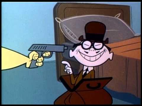
The first TV cartoon is born with the debut of Crusader Rabbit in 1950. Meanwhile, the first TV cartoon in colour is Colonel Bleep in 1957.
Crusader Rabbit was the career starter for Jay Ward and childhood friend, Alexander Anderson before creating big shots like Rocky And Bullwinkle, Dudley Doo Right, Fractured Fairy Tales, George Of The Jungle and a few more that should be worth noting.
Colonel Bleep has such magnificent colour taste. The cartoon’s art is so individualistic, it feels like I’m looking 20 years into the future…
The reason why Limited Animation managed to maintain good movement at first is because the cartoonist knew what frames to keep and which to cut under a strict deadline. Although in-betweens are undoubtedly very important, Keys dictate the extremes and should always be prioritised with the exception of losing potential for slower action.
Recently, there has been a misconception that more fluid animations equates to quality, a horrible observation. Modern CalArts has a tendency to brag about their animation with out-of-the-ordinary fluid animation, yet the acting remains just as stale as anything else produced by them. I blame Disney.
The 50s and 60s were occupied with character expression in its entirety before even bothering to add more frames. I’d like to clarify that if you have the chance and time, more frames is almost always better, but fluid animation won’t excuse unoriginal layouts.
Take a look at these incredible Jim Tyer Felix animations… During the show, Joe Oriolo stated that if the animation sheets couldn’t fit under his office door, too many drawings have been done. This must mean that they were forced to use less than 50 or 100 papers.
On that topic, the start of the silver age was heavily assisted by the golden age cartoonists. Rod Scribner And Bill Meléndez were both Looney Tunes artists that went on to work on Peanuts. Bill in particular met Charles Schulz in 1959 when developing Ford commercials. Melendez was the only person who actually had official permission to animate Schulz’s creations.
He also helped developing the animated version of Garfield and is the person you hear every time Snoopy or Woodstock make noises. His archival recordings continue to be used in modern Peanuts instalments such as the Peanuts Movie.
Other key figures of this convention include Ed Benedict, Jay Ward, Harvey Eisenberg, Friz Freleng, Gene Deitch and even Ralph Bakshi again.
Most of the major players in the 90’s Renaissance and Neo UPA also started in this convention by the time the 80’s rolled around…
Think of Mark Kausler, Bill Wray, Lynne Naylor, John K or Eddie Fitzgerald who have all worked at Filmation, one of the most infamous animation companies during the dark ages.
“I started to do my stuff in the early 90’s, and we were just getting over the 80’s which is, you know, the dark ages of animation, especially in television. So, there was the old guard and the new guard, and the old guard was burnt out and tired and angry. And the new guard, we’re like super excited to get into it.
And, um, and then, theres all these rules and nobody knows why it’s like that. I know when why I first started at Hanna Barberra, there was some of the old guard left and they would tell me stories about these amazing, you know, animators who worked on the classic Tom and Jerry’s. And they were just spending the last of their days at Hanna Barberra working on Smurfs…”
-Genndy Tartakovsky
now, I bet your asking, what’s the difference between Limited Animation and Upa? First of all, Upa doesn’t need to have choppy animation. Secondly, not all of Limited Animation is sharp and minimal, some of it just looks horribly depressing. Case and point, 80’s animation…
Compare these with the ones above… Sure the 50s, 60s and 70s had their flaws, but they still looked like they were made by human beings. The colours here are ugly neon and everyone has minuscule eyes that makes emotions hard to read. All character move the same and every drawing is poorly traced
The reason for it being how it is leads us to profit maximisation. Companies began to take notice to how cartoon characters are prime contenders for toy figurines and decided to concentrate all their efforts on this premise. For classic cartoons, the toys were just an extra aspect for merchandising but 80s cartoons live and breathe just to sell toys.
The situation was so bad that the people in charge of these shows had the theory that only seven types of stories exist and that they must be recycled whenever possible. The scripts were so unimaginative and low effort, that Tom Minton apparently lighted a few of the scripts on fire out of frustration and the rest of the cartoonists had to stomp the flame away.
Furthermore, this marks the period where outsourcing took full effect. Instead of animating everything, companies outsourced their animation to Korean studios and the end result was almost always a disappointment. Also, Nick Cross stated that many Modern CalArts cartoons look so banally simple because Korean outsourcing didn’t like complex designs.
Very rarely does an outsource receive an artistic touch. These 1985 Jetsons layouts are a rare example of good outsourcing. The cartoonists actually taught the young Chinese/Taiwanese crew appeal and the works looked great!
The irony of comparing Western cartoons to Asian ones is that these days, both are actually animated by Asia… Let’s not forget how Modern CalArts takes every chance to cram Anime references down your throat.
Speaking of Modern CalArts, another similarly between it and 80’s Cartoons is that they’re both very priggish. Interestingly, a big player in Modern CalArts, Ian Jones Quartey, expressed distaste towards the community build on cartoons on his social media. It’s a good step forward, I suppose.
“However, what I learned is that audiences do not come to a kid’s cartoon for sarcasm, they come for genuine “good morals” and they think that their favorite cartoon should perfectly mirror their personal politics. There’s also a generational gap: I grew up making fun of the sappy PSA content that used to air on TV and was having fun parodying it. Much of the audience now have no context for that and seem to crave “good messages” from their cartoons. That’s totally fine, but it was never really my personal goal.”
Related to the formulaic behaviour of Limited Animation, it seems to get a cash cow, and milk it until it’s as dry as the Sahara desert. The best example is Scooby Doo. The cartoon became incredibly popular and it wasn’t long before Hanna Barberra themselves started to make ripoffs of their own creation (Goober And The Ghost Chasers or Jabber-Jaw to a much lesser extent). As far as I know, Scooby Doo is also the first cartoon to popularise the realistic anatomy and “flesh-eyes” look that plagued the 80’s.
Also, Hanna Barberra’s Flintstones is the first cartoon to be marketed as a sitcom. As you may know, its premise functioned as the cast of The Honeymooners in a prehistoric setting. Because of this, the show caught on with an adult audience which is especially funny today considering that the things kids watch on the internet are even more vulgar than a show intended for grown ups in the 60’s. Despite the Flintstones being considered family friendly in the present, a lot of the marketing with Fred and Barney was used in Cigarette and Beer commercials, proving that there was a change in age rating.
Flintstones also started lookalikes. Think of the chronological opposite, The Jetsons or The Simpsons, a show we’ll get to later.
Ever since the Japanese economy crashed in the 90’s, Anime and Limited Animation became very similar to one another. In one case, Lupin’s creator Kazuhiko Katõ visited Hanna Barberra. David Doi sent a message and drawing to Katõ, thanking him for his visit.
“I went to Warner at the beginning of December. They wanted to make a Lupin animation. I was surprised at how well they treated me. The transportation between the hotel and Warner was a Cadillac limousine with drinks. It had a bar, but I don’t drink alcohol, so I drank juice. The limousine driver was a Japanese man who had driven famous VIPs such as Mr. Nakasone. I was happy to meet Hanna and Barbera. I had wanted to meet them for a long time. Hanna and Barbera are the ones who drew the early Tom & Jerry. They also created The Flintstones and Wacky Races. They are now 91 and 86 years old. They were very talented, weren’t they?”
Wacky Races was probably mentioned by Katõ because the series was apparently immensely popular in Japan. On that topic, Top Cat achieved a lot of recognition in Brazil, together with Woody Woodpecker who was also under Limited Animation.
Following television, commercial cartoon characters also arrived. Mascots such as Tony Tiger, Trix Rabbit, Tootsie Roll Owl, Mr. Monopoly or Charlie The Tuna are just a few. Charlie was even created by Friz Freleng who also gave us Pink Panther and many Lonney Tunes characters such as Porky or Sylvester.
Discussing Looney Tunes, Limited Animation marked the franchises death. Caused by executive interference, both Daffy and Sylvester were paired with Speedy Gonzales because of his popularity at that time. This period was considered the Dark Age of Looney Tunes and jokes would be constantly reused, pairings would often not make any sense and art stiffened. Looney Tunes also created new characters but none of them became very timeless (Cool Cat, Merlin Mouse or Bonnie And Clyde)
Past Looney Tunes directors like Bob Clampett also had their own individual show, Beany And Cecil, a cartoon about Beany, a cherub-cheek boy, and Cecil, a SeaSick Serpent. It began airing in 1949 and continued in 1962 where it became completely animated. It would also contribute to the dark age of animation with the 1988 iteration, passed down from Bob Clampett to John Kricfalusi, Ren And Stimpy creator. Apparently, Albert Einstein of all people was a big fan. Sometimes, Einstein would abruptly end his important conferences and explain “You will have to excuse me, gentlemen. It’s Time for Beany”.
Despite Limited Animation being a convention that primarily thrived during the Silver Age and the Dark Age, it did firstly appear with Paul Terry through Aesop Fables and Terry Toons. He was the first to intentionally implement cutting corner methods to maximise efficiency in animation. Although the “ring around the collar” technique was popularised by Iwao Takamoto (creator of Scooby Doo and Astro the dog), Farmer Alfalfa used it first and made it possible to produce new cartoons every week, a feat still impressive to this day.
Also, Alfalfa appreciated a brief revival in the 50’s with The Farmer Alfalfa Show. The series is worth noting because it was meant to be a mix between Rubber Hose and UPA, where crew member such as Carlo Vinci and Jim Tyer had to remind themselves how they drew cartoons when they were still young. It’s almost elegiac.
Cartoon Network’s / Adult Swim’s “Space Ghost Coast To Coast” is a very special example of cartoons during the 90’s as it creates a talk show reusing cels from the 1966 Space Ghost Cartoon. It’s technically the collage alternative for animation. The show worked with a lot of dry humour and was the origin point of “Aqua Teen Hunger Force”. A large list of well known figures were interviewed (Conan O’Brien, Jim Carrey, Elvira, Matt Groening, Weird Al, Hulk Hogan, Björk and Bill Clinton is only scratching the surface). Here’s the interview with Craig McCracken during production…
In the present, Limited Animation unintentionally lives on through Modern CalArts but it does receive occasional harsh but nostalgic tributes from the Neo UPA group. McCracken especially likes to look back on them. His Netflix show, Kid Cosmic harkens to choppy animation while an episode of Wander Over Yonder takes a jab at the dark age and even references the mass produced toys.
Kid Cosmic has its faults but I respect the vision, especially since McCracken was developing it starting from 2009
We’re moving onto the second placers!
40’s (and 50’s) Termite Terrace: Second place
(+ Termite Terrace Alumni And Influence)
Alright, this might be my favourite animation convention out of all!
Since it relies on a single company’s output, it does falter in the unique department as all of the cartoons above are Looney Tunes. But, I argue that Termite Terrace still produced the best cartoon series in history!
When I take a look back on every single animated work to be produced and count every single time I’ve been blown away, Termite Terrace always seems to come to mind, especially works from the 40’s. I must admit that I did sneak in a fair amount of cartoons from the 50’s but I think it was a good decision as Chuck Jones’s best work started there. You can probably tell which ones are from the 50’s by looking at the backgrounds which are usually sharper in design, leading into the silver age.
In case you’re wondering why the conventions name is Termite Terrace, here’s a video with Bob Clampett explaining the studio’s origins.
Anyways, what makes the Looney Tuens the Crème De La Crème of cartooning for me?
Reason 1) Artistic Individuality. Ever since the Bosko cartoons, Termite Terrace always had separate production departments, led by their most promising members. What’s interesting about this is that all of the directors didn’t need to abide by any rule book. Their own way of drawing is prioritised over consistency in style between episodes and this gave every team a unique identity in their films.
The best example of this is with Daffy Duck. Every single director that used him changed his character in some way. Tex Avery debuted the duck as an heroic screwball. Bob Clampett made him even more whimsical and goofy, but now also foolish. Frank Tashlin did the same but made him more edgy. Chuck Jones turned him into an egotistical and selfish jerk while Friz Freleng cemented him as an antagonist by the tv era. Through the series’s original run, Daffy slowly became more and more unlikeable (which is very OK), but only as of recently did Daffy lighten up a little bit with Peter Browngardt’s take.
These specialisation units are wonderful because they encouraged change while bringing friendly competition between every director. Looney Tunes is like an exposition in the way that every painting has its own style and intent. Even in singular episodes, you can even pinpoint where the animator is changed simply because you can make out their “signatures” by the way they draw the characters. I say, why bother with being On-Model when the way cartoons change illustration contribute to the emotion and memory of a scene?
Just like any good artist, cartoonists constantly evolved, so you shouldn’t hold yourself to the barriers that you’ve put down when you were less experienced. The beauty of all of this is that the cartoons were always coming up with new concepts, never becoming stale or settling on the same-old. I thinks it’s something that present-day cartoons should learn from. When was the last time you’ve seen a Modern CalArts character change designs and experiment just for the sake of it?
All of this and more in the span of a decade!
Here’s how Rod Scribner drew Bugs Bunny in the span of 3 years after adapting a Litchy influence.
Some might argue that there is no point in changing designs because the present iteration is already good enough and the following might look worse. To that I say, CARTOONS ARE A VISUAL MEDIUM! USE THAT! You’re never going to find your next masterpiece if you keep hitting your head against a wall and take no risks. And no, western anime (diet anime) does not qualify as a new take…
Reason 2) Skill. Although art is subjective and there isn’t necessarily a wrong way to do it, you can usually tell when a drawing is made by a professional vs an amateur. Skill in cartoons is needed for properly displaying emotion in a scene, as well as making the shot be understandable and read clearly. For 1900-1955/1960, animation was constantly becoming better as the cartoonists behind the medium improved their craft, learning from their mistakes and kept polishing their projects until they were basically perfect. Once the original masters died out, they were replaced by younger fellows who were too proud of themselves to look back at what made the originals great. Because of this, cartoons have had a decline in the 80’s and the 2010’s because of new crew members making the same mistakes that the oldies did way before.
Basically, if you want to break the rules, you need to know the rules! Usually the functionality of a cartoon character is improved if the artist follows certain guidelines. Some are:
SOLID CONSTRUCTION
LINE OF ACTION / LINE FLOW
GOOD COLOUR DESIGN
STRONG SILHOUETTE / CLARITY (A Clampett Favourite)
FRAMING
JUXTAPOSITION OF PROPORTIONS
PERSPECTIVE AND FORESHORTENING
ASYMMETRY
NEGATIVE SPACING / ORGANIC HIERARCHY
And, EXAGGERATION
Well, won’t you look at that! Looney Tunes has it all! One of the few cartoons on this planet to do so…
This isn’t even cherry picking. Watch a classic Looney Tunes cartoon and most of these traits usually fill out in the first few seconds.
Reason 3) Emotion. Of course, functionality isn’t enough to make a cartoon good. If you’re skilled but you lack any feeling in your cartoon character, drawing it will basically be a math exercise (and no one likes math). That’s why it’s important to bring humanity.
Looney Tunes has this in spades. With each skilled drawing technique, theres another specified emotion or eccentric personality displayed. Over my entire life, I’ve gotten reasonably attached to the Looney Tunes characters and I think that’s because their flaws and personalities feel so genuine, as if their entire existence are caricatures of actual human begins.
For some of the designs, this actually is the case!
Bugs is based on Clark Gable and his name is taken from cartoonist Ben “Bugs” Hadaway, the man who created the first design for the rabbit and titled him “Bug’s Bunny” (Note the possessive in “Bug’s” ).
Foghorn Leghorn is based on Senator Claghorn
Yosemite Sam was created by Friz Freleng as a “self insert” of sorts. Of course, Yosemite as a self insert works while others fail because he isn’t a flattering image of Friz while clearly being meant to be treated as a character, not a speaking device.
Elmer Fudd is based on Joe Penner
Clampett’s Goofy Gophers are a direct parody of Chip and Dale.
Tweety is designed after a picture of Bob Clampett as a naked baby.
Pepe Le Pew is based on Charles Boyer.
Porky Pig is based on Leon Schlesinger and his name was taken from Friz’s childhood where colleagues used to bully him by calling him “Porky”.
Dr. Lorre is quiet obviously based on Peter Lorre.
This makes Looney Tunes the first series to reference the impressionist and would make way for all other lookalikes in the future. It’s very likely that Peter Lorre is the most used cartoon caricature in existence. His appearance has become so common that this type of character is now an archetype in media (the quiet but sadistic hunchback)
So, just to make it clear, references do NOT equate to quality. In fact, I think references are a cheap way to make people like your work because it leeches of pre-existing art that is already beloved.
My argument is that the only way you make your characters be original is by basing them on your own honest and personal life anecdotes because, at the end of the day, no person you meet is a direct copy of another. I’m also trying my best to stop using stock character types and if you are a creative too, you should also try it out!
Basically, The people over at Termite Terrace were all invention, no formula. They didn’t abide by a style but rather drew what they thought looked best, explaining why creative decisions were so different between directors. They observed the life around them and let their eye naturally envision the shapes needed to convey the world. That’s partially the reason why everything feels so charismatic and lifelike despite the cartoons not abiding by realism at all.
Chuck Jones puts it best…
“I don’t think it has to be realistic. It just has to be believable.”
Reason 4) Joy. A big motive why the look of Looney Tunes is so liberating and jolly is because the crew were fun themselves. There are so many amusing or intriguing stories regarding Termite Terrace, it really gave me an insight into how each artist lived their lives and how their lifestyle affected their artistic sensibilities.
There is a boatload of books, internet sites, documentaries and videos about these people and I simply can’t share them all with you. So, here is a gag reel made by the crew.
You can also pair the viewing from above with this audio commentary of An Itch In Time, accompanied by Meléndez and Kricfalusi. Melèndez talks about Termite Terrace’s atmosphere in the video.
It seems like Chuck Jones and Bob Clampett were arch enemies, always at each other’s throats. Certain crew art and stories also seem to approve of this idea. They have been documented to act like feuding siblings while Tex Avery seemed to be a mentor/role-model to them.
Anyways, not only are Termite Terrace members great at draftsmanship and doodling, most of them are also loving family folks. Case in point: Rod Scribner who was described by his granddaughter as a very loving grandpa.
“Rod Scribner, my Papa, was a great grandfather, and used to bring my sisters and I pastel crayons, and drawing tablets. He would sit on the floor and show us how animation worked by drawing a character on 3 pieces of papers, and then flipping them quickly before our eyes.”
I like to separate the art from the artist but in the situation where the artist truly is a good person, I’ll be more than glad to accept them.
Reason 4) Alumni. During Hugh Harman’s and Rudolf Ising’s reign on Looney Tunes, most of the cartoons seemed to function as alternatives of what Disney was doing at that time. Although Bosko slowly garnered more of a crude personality, it’s said that Hugh never managed to let go of his grudges against Disney and always tried to beat him at his own game.
Once Harman and Ising left WB and migrated to MGM, the new leaders seemed to experiment a bit more with developing a proper identity for the studio. Nevertheless, jabs at Disney continued to be thrown and Ub Iwerks, first designer of Mickey Mouse, directed two Looney Tunes shorts in 1937 as well as creating Gabby Goat, a lesser known member of the Looney Tunes cast.
It was only around the very late 30’s where the studio began to find their own voice. George Litchy’s influence updated the Looney Tunes character’s designs to be more loose, organic and bold. Because of this, Rod Scribner’s experiment completely revolutionised the crew’s style, even if some of the directors were more begrudging to change like Freleng.
In other words, Termite Terrace no longer saw noodle arms and kitschy animals as a viable business strategy.
Eventually, Termite Terrace was no longer a second rate studio, but a field leader in the 40’s, finally settling on the comedic anarchy that they are so well known for.
In the blink of an eye, Disney now had serious competition and other businesses also began to shift gears, frequently scourging for WB members to hire into their own studios.
Ben Hadaway joined Walter Lantz and assisted with the creation of Woody Woodpecker, voiced by Mel Blanc (If you have ever watched cartoons, you’ve heard him already).
Walter Lantz also collaborated with Termite Terrace in the Mr. Hook series of shorts, toons relevant to World War II.
Tex Avery joined MGM and made his best work there. He pioneered the “Wild Take”, a type of expression that became synonymous with cartooning. Even the more conservative MGM directors, Hanna and Barberra, began to apply the Wild Take into Tom and Jerry cartoons.
Chuck Jones also joined MGM around the 60’s and began to direct Tom And Jerry Cartoons. He also directed “The Bear That Wasn’t” a toon based on a book that Termite Terrace member Frank Tashlin created.
Most famously, Chuck also directed what is arguably the best Dr.Seuss adaptation, “How The Grinch Stole Christmas”. The technical skill and wretchedness of form for the Grinch always impressed me and it still does.
The only other Seuss adaptation that I can imagine topping Jone’s Grinch would be Gerald Mc Boing Boing. My answer to which one I like more is dependent to the day you ask me.
We can also tie in Dr.Seuss himself with Termite Terrace because he worked with the crew for the Private Snafu cartoons, shorts made for World War II soldiers in order to entertain and teach them about safety procedures.
This makes perfect sense considering how much of Dr.Seuss’s art during the Second World War was heavily patriotic and based on American propaganda.
According to 50 Greatest Cartoons, the second best Tex Avery short is 1947’s King-Size Canary. Despite appearing under the MGM title card, the idea for the cartoon was actually taken from Avery’s Termite Terrace days.
In 1941, Tex left a Looney Tunes film unfinished that would later be completed by Bob Clampett. This cartoon was Cagey Canary and starred prototypes of Sylvester, Tweety and Granny. Amusingly, the cat in the short seems to be a tongue-in-cheek caricature of Avery left in by Clampett. This was never confirmed or denied but the context and hair design makes it a strong theory.
This technically implies that King Size Canary is an unofficial sequel to a Looney Tunes cartoon. Even the cat in King-Size Canary seems to be a Sylvester Lookalike. With all that being said, I think this is the most interesting alumni case by far.
Reason 5) Longevity and artistic representation. No matter what convention you like most, Looney Tunes has got you covered.
Like Disney? Watch the early 1930’s cartoons.
Like UPA? Check out the 60’s cartoons.
Is Digital 3D your type? There’s an entire collection of theatrical 3D shorts all available on YouTube.
Are you more of a Claymation Person? Look at Daffy In Wacky Land.
Rubber Hose? Take a look at Bosko and early Porky Pig.
Prefer Comic Strip adaptations? Daffy is as a comic fanatic and many of his cartoons consist of him childishly filling in the shoes of his comic heroes (Duck Twacy, Duck Dodgers, Stupor Duck).
Interested in Pre-Rubber? Check out Alice Comedies and Oswald.
Underground, you say? Take a glance over at Steve Peck’s 1975 Rabbit Habit. Recognised by Chuck and Tex to a varying degree of approval, it has a very interesting story behind it.
You want Anime? I can point you to studio Toei’s Majokko Tickle which somehow received the right to officially have Tweety appear within it… I am as dumbfounded as you are.
What I mean to say is that Looney Tuens has been sticking around for a very long time and its various iterations have made it a goldmine for convention representation.
And finally, Reason 6) I just think it’s funny… What more is there to say? There’s no better way to explain myself than just encouraging you to watch them too.
They existed throughout my entire life and the people behind these shows really grew on me, even if I’ve never gotten the chance to see them. I just think a job like theirs is so fantastic, I can’t help but think about them whenever I have the chance.
Unfortunately, my adoration for these cartoons can never be taken seriously as many people think of them as simple-minded flashing colours. Whenever I take a an analytical look at these flicks, passer-by’s look at me like I’ve just spoken gibberish.
But then again, a good cartoonist should never think of themselves as a superior life form. That idea simply goes against the act of liking cartoons.
I love Bugs, Elmer, Daffy, etc. But, it was never a case of seeing their faces that made me happy. It was the people behind those faces that truly made me realise that animation is so wonderful.
Tex himself knew this from the start…
“He wasn’t Bugs without the gags we gave him.”
Even if these characters disappeared the face of the earth, I’d know they never truly left if people continue to learn, evolve and make cartoons for the sake of them being cartoons.
[When asked how he wanted to be remembered] “I just want to be remembered. Period.”
-Bob Clampett
Joe Dante was supposed to direct a movie based on Termite Terrace but it never went through as Warner Bros thought kids wouldn’t care. They were probably right but that doesn’t mean they had to make Space Jam.. Here’s the script.
“Throughout history, man had left great landmarks of culture. These are the places where great people’s ideas were born, the Parthenon, the Roman Forum, Colosseum, the Great Wall of China, the Palace of Seyid, the White House, the Eiffel Tower, Taj Mahal …and Termite Terrace. Yes. Termite Terrace. For just as Abraham Lincoln was born in the Rubloff cabin in Illinois, so to the simple clapboard building called Termite Terrace, was “the humble birthplace” of one of the world’s most beloved comedians,Bugs Bunny.”
-Orson Wellesu
Long story short, Looney Tunes rules!
Enough corniness. It’s time to move on!
Action Toon: Second place
It’s a bird! It’s a plane! It’s… Another cartoon convention!
Action Toons usually fall on extremes. They’re either the best examples of cinematography and complex plot lines to latch onto, or the biggest piles of rubbish from a mile away. Everything feels hit or miss.
This one might as well be called “musclemen” because that’s what it basically is. I’m not the most knowledgeable in Action Toons because I always preferred funny animals over caped heroes but I’ll try to explain myself like I’ve done with anime.
Depending on who you ask, the first cartoon to place a lot of emphasis on action is Fleischer’s Superman from 1941. It feels fitting once you consider that the 1938 first issue of ACTION Comics starred Superman in his debut.
Batman shortly followed in 1939 but only got his first cartoon much later in 1968.
Today, Superheroes are known by everyone and have since been run to the ground with derivative adaptations that retcon everything while overly focusing on multiverse stories.
Back then, however, these character clichés were never before seen. The concept of having characters with normal human proportions engage in super powered battles was considered strange and new. I think it’s even stranger now that we all accepted how the universal symbol of being a postmodern deity is related to wearing your underwear over your suit…
These characters became so popular because they provided a fictional, yet hopeful getaway from everything in the real world (The Great Depression). I know it’s corny but Action cartoons are arguably the most escapist out of all animation because it focuses so much on power fantasies.
Back to Fleischer, Superman was actually the second time the studio ever experimented with a more realistic design. The first was with 1938’s Gulliver Travels which impressed its audience through detailed rotoscoping. Afterwards, Superman’s creators, Jerry Siegel and Joe Shuster struck a deal with Fleischer to produce animated cartoons with their character.
This experiment largely paid off and the first short of Fleischer’s Superman even joined 50 Greatest Cartoons at #33. Its influence would also go overseas with Hayao Miyazaki basing LAMBDA’s design from Lupin The Third: Part Two on the antagonists from 1941’s “The Mechanical Monsters”.
Disney famously adapted the realistic look for their characters starting from 1937 but last time I checked, Snow White hasn’t joined a boxing ring so I’m not counting it in this convention.
Although action style comics were still going strong throughout the 40’s and 50’s, it’s animation counterpart was on a hiatus of sorts and only came back during the TV-age with notable cartoons being Spider-Man or Teenage Mutant Ninja Turtles. Whereas the 1941 Superman had masterfully made animation, these TV ones had next to none.
Action Toons suddenly had a boom in the dark age where companies saw immense potential in them, creating new series for the purpose of selling toys. Very shortly, the concept of action cartoons with realistic anatomy became the plague for struggling artists and the convention received a decently bad stigma in the following years.
It got even worse when these cartoons lost their fighting, the sole reason for the convention’s existence, and replaced it with sappy PSA compilations with badly drawn stiff unfunny grown men who explain why decaf is better to drink than coffee as if any child would care at all (pardon my adjectival verbosity).
In revolt, the crew behind The New Adventures Of Mighty Mouse dedicated an entire cartoon to mocking these preachy shows and centred the episode’s villain as “The Real Gag Busters”.
I personally think that most of these action adjacent characters were more stylish in their original medium, comics. Take The Mask as an example.
The primary comic series was much more unsavoury as the people behind the mask weren’t always framed to be heroes, not-even anti-heroes in certain occasions. Some of their “revenge” murders are close to being unjustifiable but when the 1994 movie based on the comics began production, the protagonist’s morality was much more playful, heroic and aligned more with Carrey’s comedic tone.
I’m not saying that something sordid instantly makes something good. It’s just that the old concept for The Mask was that he was “Tex Avery meets The Terminator”, whereas now, he’s just Tex Avery. The juxtaposition really made the stories feel dynamic even if sympathy for the protagonist was off the table for the most part.
The children’s animated series for The Mask is the probably the first time where the character was completely ruined. The movie at least had respect for the source material and you could spot traces of it in the final product. Also, the movie is another contributor to the rebirth of cartoony cartoons and “behind the scenes” videos show a lot of ingenuity into how the crew managed to translate animated movement into a live action film.
On that topic, the 90’s harkened back to the quality of Fleischer’s Superman and let more creator driven work roll around.
The most well known is definitely Batman The Animated Series, one of the most respected cartoons with designs deriving from Bruce Timm. Despite having occasional mediocre drawings from some of the Korean outsourcing, the show still retained a flow of admirable artistic merit and started Genndy Tartakovsky’s career in animation, where he later created Samurai Jack, the most outstanding Cartoon Network show according to audiences and critics.
Unlike limited cartoons, Samurai Jack’s crew consisted almost entirely of cartoony-drawing cartoonists (Craig McCracken, Rob Renzetti, Paul Rudish, Bill Wray, Chris Reccardi, Scott Wills, Don Shank, Lynne Naylor, Dan Krall, Craig Kellman, Charlie Bean,). The Andrew siblings, Bryan and Mark seem to be the least cartoony in the crew with many credits in live action movie like SpiderMan or Iron Man 3. Still, Samurai Jack is known by everybody as the love child between Hanna-Barbera and Akira Kurosawa.
It’s incredible how well wacky hi-jinx and heart pounding camerawork mix so well. I also believe the show has some of the best pacing in any cartoon with perfect cut durations and a good grasp at understanding which scene should go by faster or stick on for longer.
Another Action Toon that I think is really worth mentioning is The Maxx. Just like most superheroes, The Maxx originated from comics but his animated adaptation is simply mesmerising. Created by Sam Keith, the show’s mood and art is so original and like nothing I’ve seen before. The characters move as fluid as Disney’s, but the visuals are so detailed In its crude ruggedness. All the while certain stills look like they got ripped out of Salvador Dali’s dreams.
In addition, Sam and David Feiss (Creator of Cow And Chicken) are cousins. Since they knew each other since childhood, Keith let David draw one of the Maxx comics in his style. Feiss’s section is also seen in the cartoon.
Genndy would continue his action rampage with works such as Sym-Bionic Titan, Unicorn Warriors Eternal and the most beloved by fans, Primal. We’ll talk more about that one in two other conventions.
He also got the chance to create The Clone Wars Animated Series after George Lucas realised that Genndy was the one who developed Samurai Jack. He was intended to be head of LucasArts after but Tartakovsky’s own plans closed the possibility of that happening.
The micro-series would receive its official successors through various 3D instalments that would be carried out throughout the 2010’s. I’m a bit bummed that the shows were no longer 2D but at least the original managed to find a proper continuation through them.
By the way, Genndy’s version of General Grievous is undeniably the best. It made George’s version look like a whimpering dog in comparison.
Despite being arguably the most respected cartoonist in the industry right now and having a successful track record, he still has to fight hard just to get his pitches accepted by distributors.
For example, as of 2026, he’s been trying to green-lit The Black Knight for more than 6 years already. A potential distributor seems to be A24. I guess only time will tell…
Genndy wasn’t the only one to get their action cartoons rejected. Aaron Springer’s Korgoth Of Barbaria is rather crude but it was pretty imaginative nonetheless and I consider it a pity that Adult Swim couldn’t turn it into an entire series. Another notable one-off Action Toon is Rex Steele; Nazi Smasher. I think the name speaks for itself.
In recent times, Netflix’s Love Death And Robots is an interesting addition to Action Toons. It’s mostly horror themed but some of the episodes feel more like action to me. I’m fairly mixed on the overall output of these cartoons because some have really great ideas but falter in the “cartoon” department.
For instance, Bad Travelling is really well made, cinematic and tackles an interesting subject but it almost felt like it wanted to be live-action. The characters faces are more concerned with showing pores rather than creating unique gestures to work from and everyone mostly has a straight robotic (no pun intended) face for the entire runtime. Pushing the expressions a bit more would have really helped and there isn’t much of a reason to make it animated in the first place.
The most intriguing episodes from the series are done by Robert Valley, in my opinion. They’re the best when it comes to combining fun lively movement with grander stories. It kind of reminds me of Genndy’s cartoons. “Ice” in particular also had Bill Wray working on it.
After so much brutality, let’s shift to something a little tamer.
Modern Disney Formula: Second place
To what extent is something considered modern? Is The Lady And The Tramp a modern movie? Many would say NO but I simply couldn’t find any truly NEW Disney movies that I actually enjoy…
My idea was that any Disney Movie that is past the Silver Age should be considered modern because that is usually the time where audiences began to associate Disney with “cute”.
The Jungle Book and The Aristocats are well known as the last film to be finished by Walt and the last film to be green-lit by him respectively before his passing. After this, everyone had to”guess” what would fit the Disney brand rather than allowing themselves to try new things naturally.
Fortunately for them, many of the original crew at Disney was still available so the original Disney charm was not yet lost. The Dark Age for Disney existed as an intermediary where original members still contributed, but without Walt’s final say in the matters.
The 90’s Renaissance was the time where the original artists also began to be phased out, replaced with newer, less experienced folk. This might be an unpopular opinion but I personally think that the Disney Renaissance isn’t much of Renaissance.
I think this for a few reasons…
1) Garish Colours
This isn’t always the case but you sometimes find stills like the ones above that are simply pretty excessive to put it nicely. There are bright colours everywhere, with each one trying to catch your attention. I’m not sure if many people care about this but it’s a little tiring to look like.
Compare this with Walt’s Disney.
2) Character recycling.
If you think about it, almost all 90’s Disney films have a wimpy but brave hero, kind but sassy girl who wants to “see the world”, wacky animal buddy that exists to sell toys and a collected villain with a sophisticated voice.
Try going over some of the films in your head and I’m sure you’ll get what I mean. I know that character tropes are a recurring theme in the entirety of media but this is a little excessive, especially when they directly follow each other in the filmography list.
3) Irony.
Modern Disney wants to be magical like Classic Disney but it also wants to look “cool” in front of the kids. Whenever they get the chance, they will try to break the fourth wall, mock the innocence of the original movies, make pop culture references, or insert one-liners for no reason.
”No no. Anything but THAT!”
At least the animation in this scene is nice.
4) Merchandising.
Walt always approved toys to be made with his characters but Modern Disney is simply obsessed with it. So much so that it feels like they are prioritised over producing films. Just look at how much Baby Yoda merch there is in the world.
Art by Bill Wray.
I think that all the products kind of devalue the artistic intentions of the films, that is if they have any to begin with.
5) Stock Expressions.
In the industry, theres this frowned upon cliché which is called the “Dream Works Face”. It’s a contrapossto facial expression where both eyelids are lowered, the mouth is angled on one side, the eyes look towards the viewer and one of the eyebrows is higher than the other, thus giving of the look of smugness or attitude.
It’s basically the bean mouth of 3D animation and is virtually everywhere, especially on posters.
Despite being most frequent in the 21’st century, it has already existed before Dream Works, especially in Rennisance Disney.
Raise those eyebrows a little higher!
6) Sing Alongs
Disney characters have this habit to break into song out of nowhere. Not because the scene needed it, but because it will make for a perfect merchandising opportunity. Remember Let It Go?
7) Worrisome model sheets.
These are reference papers for the sequel of Beauty And The Beast…
I’ve seen math exercise that look more artistic than this. These characters are supposed to be human beings with contactable facial features, not robots! What about situation specific acting? What if you wanted to exaggerate the proportions a bit? How is a kid supposed to like this? They should put a sign in front of the studio saying “NO FUN ALLOWED”. Just so the cartoonists will know what they’ll be getting into.
8) Corporate Airbrush.
Here are some classic Disney posters. They’re approachable, warm and have a homely feel. Right?
Now, here are those same movies, but with newer posters. Ever since I was young, I didn’t like them. They felt cold and boring. I saw this idea being shared by others online and I’m glad that I wasn’t the only one who thought this.
9) Forced pathos.
One of the biggest eye roles in cartoons and a plot aspect that is also shared in Modern CalArts is when a scene suddenly becomes sad even if the plot beats didn’t make sentiment feel deserved. It’s constantly used in Disney Movies to make the story feel more deep and thought provoking than it actually is.
The Day The Earth Blew Up actually parodied this cliché in the final few scenes. I won’t describe it for spoiler reasons and because it’s a fairly new film.
10) Tarnished Fairy Tales.
I remember reading the original Hans Christian Anderson 1837 tale for the Little Mermaid when I was very young. I was a little disappointed when the mermaid lost her prince to another woman and eventually turned into sea foam. Nevertheless, it left an impact in my mind that made me think about it for countless days.
Skip ahead a few years and I look over Disney’s Little Mermaid where she famously manages to marry the prince. I suppose kids wouldn’t like to play with sea foam as a toy but I do think that the idea of consequence was much better defined in the original and made for a more unforgettable moral.
Older Disney also had this problem but seeing Pinocchio being hanged at the end of the movie would have probably been a little too much for a kids movie…
What I’m trying to get to is that a lot of films make reaching goals feel effortless and gives off the idea to children that they are the best people on the planet. It’s not that children don’t deserve to be told they are loved and valued but it’s not good make them cocky either.
There are all my reasons why I don’t get along with Modern Disney.
That being said, I do think there are some nice parts. I dislike the excessive Stitch merchandising but I think the movie from which the character originated from is actually pretty good. The characters are fun, especially the aliens and an actual personal perspective can be taken away from the art.
I’m glad that the movie managed to persevere a little bit of Chris Sander’s style. It’s very flowy, the separated eyes on the characters makes them look a little dorky (but in a good way) and the colour textures have a softness to them that I can get behind.
These stitch drawings are probably the best iteration of him. They’re the perfect combination between ugly and cute.
I’ve also liked Mickey Mouse’s Runaway Brain. It came close to the more imperfect Mickey that ran wild in the 20’s and 30’s. It was a different take on the character and that is admirable.
A lesser known cartoon by Modern Disney is 2003’s Destino. It actually began production in 1946 when Walt met up with Salvador Dali and began to storyboard a possible film together. Obviously, the both of them never got to see the final product but we can!
It tells the story of a mortal woman who has fallen in love with Chronos (Embodiment of time). Dali-esque shenanigans ensue.
This movie is much older but Chuck Jones apparently worked on Sleeping Beauty. A theory between cartoonists is that he was the designer for Maleficent’s goons. I choose to believe it simply because they are so stylised and cartoony. Also, If Disney were to bring a Termite Terrace artists into their studio, I suppose Jones would fit the artistic sensibilities of Walt the most, considering that Chuck loved drawing dinky in the 30’s with characters such as Sniffles.
A comic based on Walt and Salvador’s interaction would also be created where Mickey, Donald and Goofy accidentally enter the world of Dali.
The panel above is unrealistic. Everybody knows Walt didn’t know how to hold a pencil.
Neo UPA: Second place
Neo Upa; The closest relatives to 90’s Renaissance and a symbol for an artist’s never ending struggle to keep proper construction in their drawings.
The name is pretty self-explanatory. It takes the minimalist style of UPA, and modernises it for a contemporary audience, with a bit 90’s mixed in there for good measure.
Although the UPA style was fairly cheap, it mostly disappeared during the 80’s with its last traces being seen in the early days of Limited Animation, where most UPA artists received jobs for TV productions.
Just like 90’s Renaissance, Ren and Stimpy was largely responsible for revitalising UPA, although many aren’t aware of it.
Neo UPA (Also called UPA Revival by executive Fred Seibert) is most likely to have been born in 1993 from two sources:
The first was in September 5 with the debut of Two Stupid Dogs, created by Donovan Cook, considered to be the genesis of the convention and artistically kickstarted the careers of Genndy Tartakovsky, Craig McCracken, Paul Rudish, Don Shank, Rob Renzetti, Julian Chaney, David Feiss and Butch Hartman.
It also had the Spumco alumni of Vincent Waller, Bob Jaques, Kelly Armstrong and Eddie Fitzgerald.
Not only did the Spumco crew work on Two Stupid Dogs, but the main characters also seem reminiscent of Ren And Stimpy at face value by which I mean that they share“Mutt And Jeff” or “Laurel And Hardy” buddy-comedy interactions.
Additionally, The show’s Little Red Riding Hood is based on John Kricfalusi which is apparent by her glasses and tendency to raise her voice out of nowhere. John Kricfalusi worked on the show for the three episodes starring Little Red Riding Hood and provided feedback regarding the storyboards and gags. He didn’t want to take away from the contributions of the others so he asked the studio to categorise his help as “Tidbits Of Poor Taste” in the credits.
The second source actually derives from Ren And Stimpy itself. In November 20, the third season of Ren And Stimpy premiered but its art style has significantly changed, opting for a much flatter look, much to John’s distaste.
You see, there is a more complex reason why Spumco members managed to work on Two Stupid Dogs while R&S was still producing episodes…
During the first two seasons of R&S, John Kricfalusi was said to be incredibly harsh regarding the crews’ art and had frequent outbursts whenever his members couldn’t draw exactly what he had in mind. He usually worked on cartoons past their deadline simply because he was such a perfectionist and used to sneak in the studio during the night just to draw over others’ layouts that he didn’t like.
He had such a high standard for quality that he sometimes called himself “Raymond Spum” in the credits of the episodes that didn’t sit well with him because he was so ashamed of them.
After season 3, Nickelodeon effectively terminated John K off of his own show. His co-director, Bob Camp, was made the head of the series from then on which made John refer to this event as a “backstabbing”
Some artists chose to remain loyal towards John and quit as soon as he was fired. They would later join in on other projects led by him and were also available to work on Two Stupid Dogs.
Under a new director, Ren and Stimpy were drawn flatter and had their details minimised to increase the chances of meeting deadlines. The remaining crew called themselves “Games” and would be in charge of the show until the sixth season would premiere in 2003.
This is season 2 from Spumco…………This is season 3 from Games………
Two Stupid Dogs was also paired with newer episodes of the Hanna Barbera cartoon, Secret Agent Squirrel. This “Two shows in one” concept would be continued with Dial M For Monkey and Evil Con Carne.
Eventually, What A Cartoon debuted and introduced the three most recognisable series of Neo UPA: Dexter’s Lab, The Powerpuff Girls and Johnny Bravo; created by Genndy Tartakovsky, Craig McCracken and Van Partible respectively, all of which were coincidentally roommates in college.
Other Neo UPA adjacent cartoons to come out of the program but were not green lit are Rob Renzetti’s “Mina And The Count” and Charlie Bean’s/Don Shank’s/Carey Yost’s“Buy One. Get One Free”.
Between the three, Dexter’s Lab was the first to officially air in 1996, Johnny Bravo followed in 1997 and Powerpuff Girls appeared last in 1998.
Dexter’s Lab is probably the one I care about the most. Im not sure what’s up with Genndy but his show’s humour and pacing felt very unique compared to its contemporaries.
Dexter’s Lab is still a comedy but certain scenes feel more melancholic. Sometimes, a deafening silence is prioritised over jokes and the experimentation with cinematography is usually at it’s best during these moments. The ambience would be used to an even greater extent in Samurai Jack but it’s interesting to see the concept’s roots. Anyways, the silent scenes are a big giveaway for whenever he directed a PowerPuff Girls episode. Those long takes remind me of the shootout anticipations in Spaghetti Westerns.
I also appreciate the dynamic between Dexter And Deedee. It’s based on Genndy’s own relations with his brother and the interactions serve as a very effective plot catalyst.
However, what I find most intriguing is how the show’s style evolved. One of my favourite pastimes is to look at a character’s features and see how their designs changed as time went on. Character changes usually give me the most lineage whenever I analyse a cartoon and Dexter is no exception.
Dexter originally started with more humanoid proportions, the type that you mind find at Disney. But, after taking influence from Felix The Cat’s PointDexter, the more stout design began taking form. After the pilot, Dexter became even shorter and after the second season finished, his look basically became a simplified caricature of his previous look.
Genndy explained that this happened during the storyboard phase where he and artists began to unknowingly exaggerate the features of the show’s characters.
This has led me to the theory that if you were to draw a character that you created for days on end, your mind subconsciously alters the design as your idea for the character progressively becomes more defined and clear. Once I though about this, I could almost start seeing it in my own drawings where my natural instincts guide the characters form rather than a model sheet.
This is one of the reasons why I think it’s important to let artists break from pre-established models. A character is much like a piece of clay, in which the earlier days of its creation contains more substantial change, whereas the design becomes more stiff and rigid as time passes. Whenever this happens, I say we should break the sculpture just to remould it again. Otherwise, your creations will no longer reflect your current emotion.
That’s why I scoff so much at the current industry pipeline and their obsession with making every expression stock. Episodes like “Chicken Scratch” have one of the best showcases for how many subtle shifts the characters have gone through. Dexters had basically become the size of a baby. Meanwhile, Deedee’s torso has almost become nonexistent.
Layouts by Craig Kellman.
They also mentioned this evolution on a “Bet You Didn’t Know” Cartoon Network Bumper (06:38). Notice how Lenny says that it’s “Normal” for cartoons to change? If only specific others could get off my case when I give my drawings a slight personal touch…
Should I be worried that the way I construct my sentences, the things that interest me and the way I look are almost identical to Lenny’s?
By the way, at 03:28, Lenny mentioned that in the Powerpuff Girls episode “Slumbering With Enemy”, Genndy and Craig appeared in the magazine. However, he forgot to point out that the very last image with the bald fellow is meant to be Don Shank.
The second and third, I cannot recall although they’re also probably meant to be crew member caricatures. Maybe the third is Chris Mitchell but I’m not sure. I guess that makes me an even bigger nerd than Lenny is…
Changing trajectory, Johnny Bravo is still UPA themed but Van Partible’s love for the seventies heavily impacted the show’s style. The campy colours are clearly visible in the casts’ clothing and backgrounds. The peace loving hippie aesthetic is obvious and the more run-down settings reflect the austerity of those times.
I usually try to stay away from backdrops with bright colours but I’m decently surprised at how well they’ve been used in Johnny Bravo. I also like how every building is slightly slanted. I remember reading that Jim Smith used to also skew shapes in backgrounds because they made the scenery feel more interesting while also not being distracting.
The rise of rockabilly and surf-rock is also commonly heard in the show’s musical score composed by Lou Fagenson and Christopher Neal Nelson.
The most defined 70’s detail is Johnny Bravo’s personality, inspired by musical stars like Elvis Presley and actors like James Dean which came about during Van’s college days when he had just created the first prototype for Johnny.
Another aspect of Johnny that makes him stand out is that almost every action he takes is conveyed through a smear frame, making his movement feel spontaneous and sleek. Bravo is probably the character that used smears the most through out his entire filmography, only rivalled by the likes of The Dover Boys.
In 1931, Fleischer premiered Bimbo’s Imitation. A surreal cartoon about a dog named Bimbo who forcefully goes through a set of sadistic trials constructed by a fraternity club.
The short became a cult classic among cartooniacs and influenced many artists, hopefully more to come.
One of these is Jim Woodring who described the film as “one of the things that laid the foundation for my life’s philosophy”. As a child, Woodring frequently went through sequences of intense hallucinations. At the age of five, he already grew paranoid, afraid for himself in vulnerable situations. Unable to separate fiction from reality, Jim thought that dinosaurs lived in mountains and Bugs Bunny was a human. These delusions forced the boy to drop out of high school and find help.
In his teen and adult life, Woodring often met psychiatrists, although no conclusive answers were met. Nevertheless, he was diagnosed with autism and prosopagnosia but had no resolution for his nightmarish visions. To cope with them, he began drawing what he encountered in his mind.
His love for Fleischer toons derived from their underlying hallucinatory atmosphere. He poured this love into his Underground Comic, Frank, an ambiguous animal inspired by Rubber Hose conventions and a spiritual successor to Bimbo.
Before its creation, Woodring worked at Ruby Spear’s animation company for cartoons such as Heathcliff or Alvin And The Chipmunks. The companies stifling creativity was very observable but it formed Jim into the man he is today, along with meeting cartoon legends such as Jack Kirby or Gil Kane.
Frank debuted in 1990 with the fourth issue of JIM, a comic that he decided to begin after Ruby Spears. The premise of Frank centres around subversion. Its purpose is to guide the readers into a false sense of cartoon familiarity, only for sinister imagery to slowly reveal itself. Thus, just like most underground cartoon characters, Frank does not abide by any formula.
Jim decided to keep Frank a pantomime and explained that connotation is more powerful without words (think back to Stuart’s reception theory).
“Words can be deceptive – you start using words and people apply to them whatever meanings their prejudices dictate. Images are less open to interpretation in a way.” He also stressed that the world itself in his comics isn’t mute, just the way the comics are presented to the reader.”
Frank didn’t really receive marketing, but it did win awards and positive reviews, although some describe the comic’s world as making them “physically sick”.
As for distribution, Frank comics can be bought on Amazon but if you want to go directly to the source, Seattle’s Fantagraphic store is the way to go.
Distributed by Fatnatgraphic Books, the Frank series is still kicking. As of writing this, the character’s newest book is the July 2026 entry, Quacky. With modern times, social media is used to promote and attract fans. Jim also has a website that lets visitors access his artwork, buy prints and “one of a kind” drawings, read blog posts (although no longer updated) and learn general information about him.
As Frank became more and more well known, tie-in products began to be released.
Frank received bendable figurines along with his pets, many shirts have been released and most importantly, Frank received animated shorts done by the same people who designed the toys, PressPop. The staff was titled “Japan’s Most Audacious Artists” on the DVD cover.
The cartoon was given Woodring’s approval although he chose to not interfere in the design process as he wanted to see how the other cartoonists understood the universe he created. This can be applied with another one of Stuart Hall’s theories, Representation.
This also relates to Henry Jenkins’s Fandom Theory as the Japanese cartoonists who adapted Frank are technically poaching officially.
The target audience for Frank is usually considered to be adults and teens. Some might call it “a cartoonist’s cartoon” as viewers are expected to already have a deep grasp of animation conventions and history in order to understand the artistic choices.
The comic’s metaphysical appearance also appeals to intellectuals. The director of The Godfather, Francis Ford Coppola writes:
“Frank is such a strange creation that I hardly know how to describe it. Wordless, timeless, placeless, full of unprecedented characters and experiences, it exists on its own bizarre terms. It offers vivid tableaus of tenderness and bloodshed, cruelty and sacrifice, love and betrayal, terror and bliss; and it offers them like candies from another planet.”
This is similar to Clay Shirky’s End Of Audience Theory which talks about the active participation of fans in a work.
In 1932, Merrie Melodies released ”There’s A Crowd!” for theatres. The cartoon was directed and thought of by Ising although he is uncredited.
The concept of the toon is quite simple. It’s about famous literary characters coming to life and popping out of their covers.
The very first cartoon to come up with this gag is one of Rudy’s earlier cartoons, Smile, Darn, Ya Smile!
Since then, it would become cartoon standard to have jokes where certain book covers or advertisements begin to move. Starting from “There’s A Crowd!”, A collection of “book” cartoons would continue to be produced by Tashlin, those being:
Speaking Of The Weather,
Have You Got Any Castles?,
and finally, You’re An Education in 1938.
With all that being said, this joke reached its pinnacle with a cartoon produced in 1946. A cartoon so good, that no other film could best it at the concept, thus, killing the trope…
This cartoon was directed by Clampett in his final year at Warner Brothers. The story was made with the help of Foster. Key animators are Scribner, McKimson, Melendez and Gould. As for layouts, Cornett and Thomas were responsible.
The music was provided by Stalling and the voices for most characters were predictably from by Blanc. The exception is Henry VIII who is played by Robert C. Bruce.
The film is set in a closed book store during a quiet night. Nevertheless, all book characters wake up and begin to party. Daffy, who lives in a comic is upset with the music and proceeds to sing his own, cosplaying as Danny Boy, now titled Daffy Boy.
Eventually, he enters the story of Little Red Riding Hood in attempt to warn the girl about the sadistic wolf disguised as her grandma. The wild canine appears and proceeds to chase Daffy until the finale.
The Marketing was virtually nonexistent but the cartoon itself was anticipated through word of mouth. Most interest for the cartoon derived after first airings since film reviewers got the chance to praise it then.
According to data on theatregoers, Book Revue’s target audience is primarily young adults. Termite Terrace were always adult-oriented as proved by production information which marks artistic choices deriving from what the crew itself laughed at, whether it would be visual reactions, violence or celebrity caricatures.
A target audience was also referenced in the cartoon itself, Bobby-Soxers, young women who fawn over and find great joy in musicians such as Frank Sinatra.
The cartoon also garnered newfound fame and another following with the appearance of the internet. Daffy in his zoot suit would be shared on forums with the caption “Literally me”.
The cartoon was originally aired in theatres but would later receive a re-airing with the title “Book Review” as it was highly requested by audiences.
Later on, it appeared in Looney Tunes DVD collections such as 2011’s “The Essential Daffy Duck” without any censorship. It would also be shown on Cartoon Network and Boomerang programming.
There is no Cross Media Convergence in Book Revue. The cartoon was simply produced by Warner Bros at the Termite Terrace lot.
For Technological Convergence, it can be watched on Tubi and is also available on The Internet Archive, also uncensored.
As for synergy, it continued to be heard of through print with “50 Greatest Cartoons”. As voted by 1000 professional animation historians, Book Revue was placed number 45.
Zoot Suit Daffy appeared in an officially licensed Looney Tunes mobile game and was referenced in the 90’s inspired platformer, Antonblast.
If you want to learn more about the early days of Termite Terrace, I recommend you read my retrospective on animation history…
I hope you enjoyed this case study as much as I enjoyed learning about the cartoon. If you want to see it for yourself, the link is below.
“Stunning staging, gloriously cartoony manipulation of the film’s medium, and almost savage recklessness, the result is a summation of what the Golden Age of Animation has to offer us. If any one animated short can be considered a work of genius. Book Revue is it.”