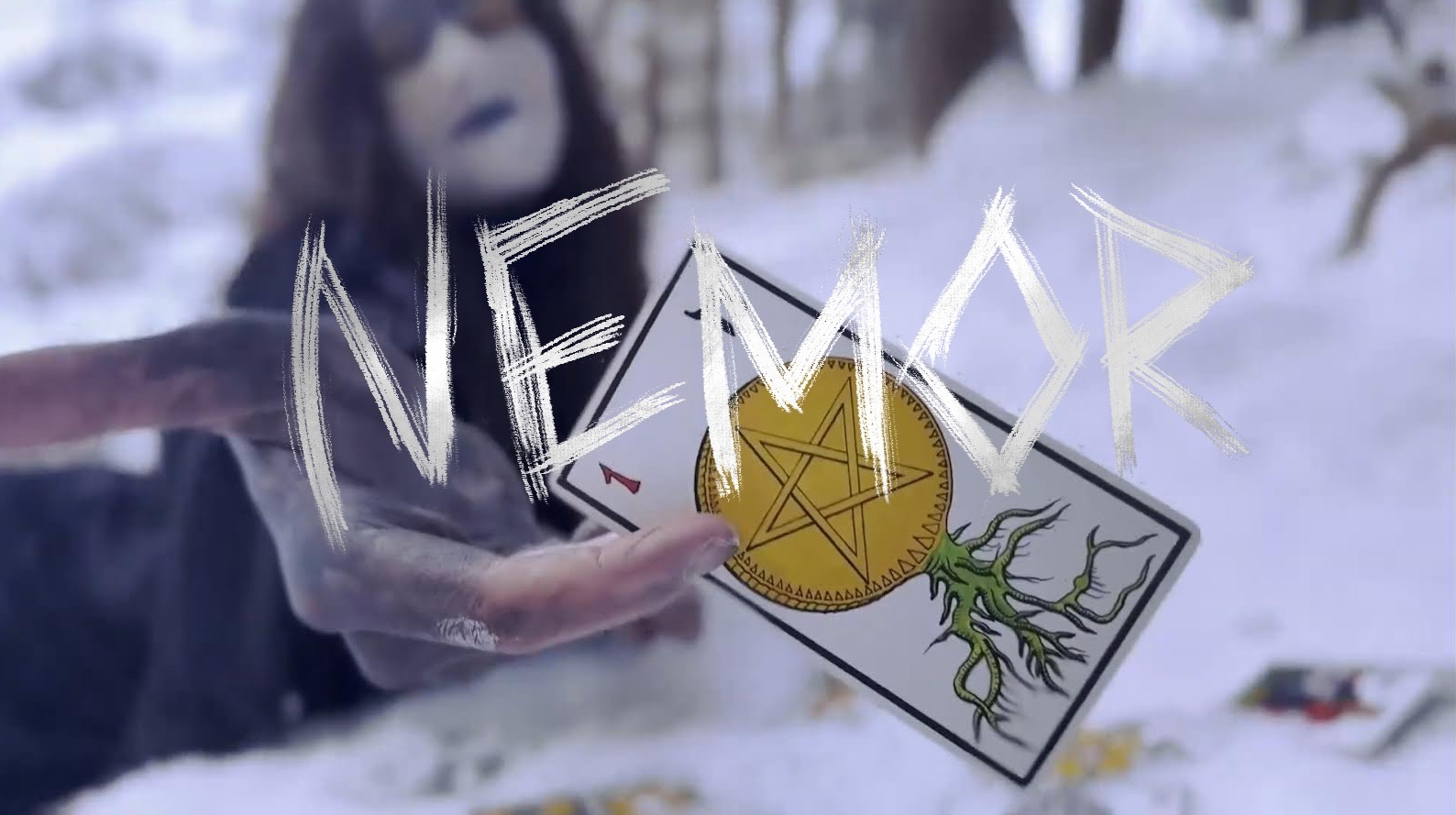
Every good movie needs a good poster to attract potential viewers. While our poster — designed as if for a hypothetical film festival presentation — isn’t heavily scripted in terms of layout or content, it still draws attention. The Ace of Pentacles emerges through a blurred background, while the entity’s burned hand reaches out, inviting the viewer to take their fate into their own hands… For the font, I used a freehand interpretation inspired by Blackcraft font, which I recreated using a brush in Procreate.
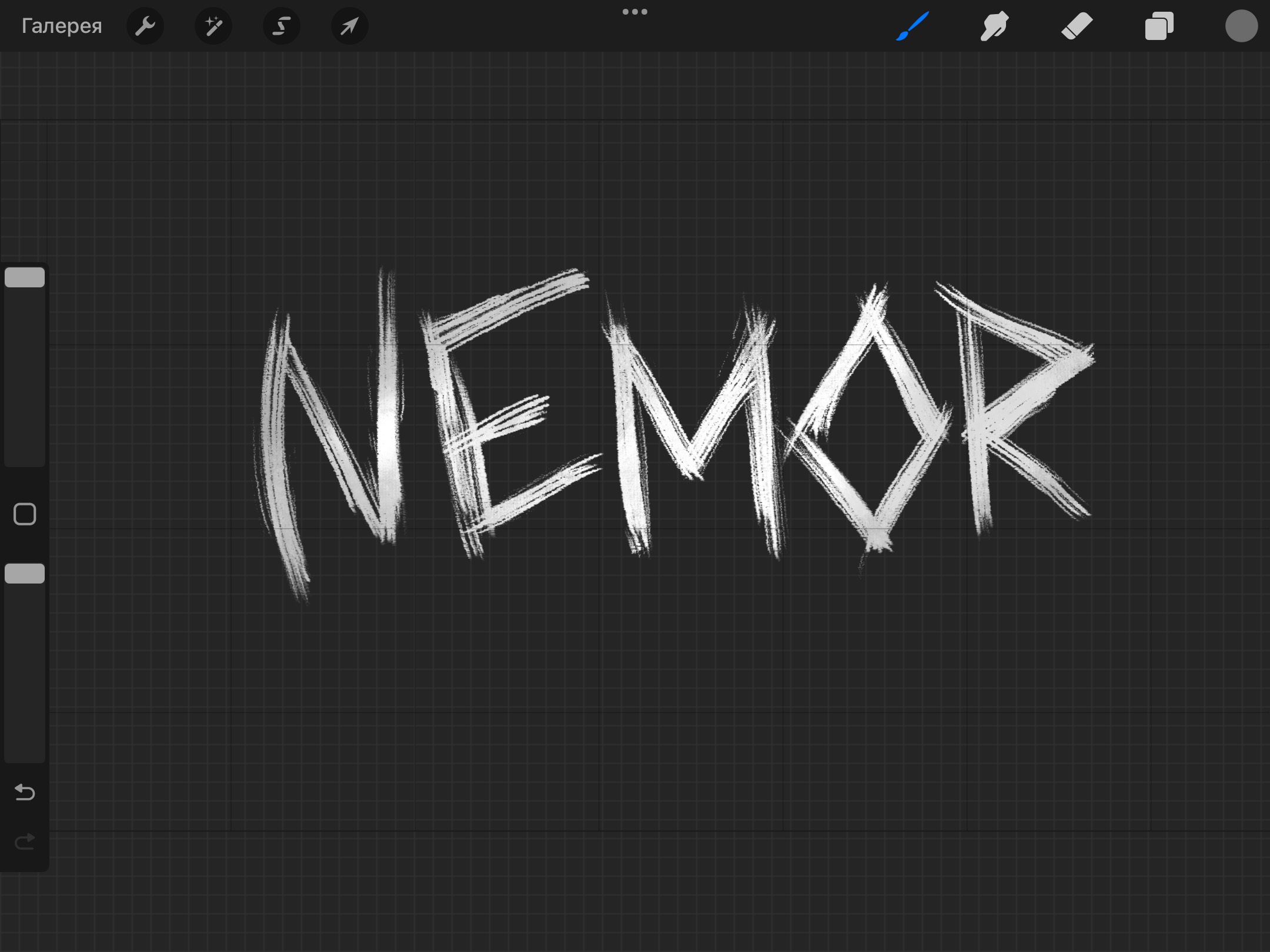
Font Creation Process. A slight gradient from white to ashy grey was added to give the text more depth and dimension.
Leave a Reply